Quick Logo Improvment
- Status: Closed
- Prize: $15
- Entries Received: 19
- Winner: ralphkhen

Contest Brief
** THIS CONTEST IS CLOSED ** We will only be voting on the entries currently submitted. Thank you to everyone who participated
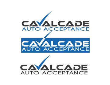
My client has a Logo that they are pretty happy with they want it improved. The overall design should not be changed very much. Different fonts and checkmark are okay to use. Colors should remain in the dark gray and blue family, maybe green if it is fitting for the checkmark.
Attached are their top three picks from the last designer, let's see what you can come up with but please keep it professional
Winner will be chosen within 12-24 hours - good luck everyone, thank you for participating!
Recommended Skills
Employer Feedback
“So many great logos to choose from, Ralphken's was voted the best of the best. Great work! Thank you. ”
![]() ArchaicGuru, Canada.
ArchaicGuru, Canada.
Public Clarification Board
-

dej91
- 8 years ago
Congrats to winner
- 8 years ago
-

ralphkhen
- 8 years ago
Thanks
- 8 years ago
-

Contest Holder - 8 years ago
thank you to everyone who participated, everyone did a great job, I wish I could have picked them all! All top artists will be invited to future projects
- 8 years ago
-
dej91
- 8 years ago
Was my work in the top 5?
- 8 years ago
-
Contest Holder - 8 years ago
yours was in the top 3, I will invite you to more contests in the future!
- 8 years ago
-

Mishaaljatoi1
- 8 years ago
Done! sir please check and let me know if you like or you need more adjustments..
Thanks...- 8 years ago
-
Contest Holder - 8 years ago
thank you, some of your entries look great. good job!
- 8 years ago
-
Mishaaljatoi1
- 8 years ago
Thanks
- 8 years ago
-

skilledoffice
- 8 years ago
As per your suggestion we have edited and added an updated logo please check entry #36
- 8 years ago
-
Contest Holder - 8 years ago
looks great thank you
- 8 years ago
-

masvenkatin2008
- 8 years ago
any suggestions for me to update?
- 8 years ago
-
Contest Holder - 8 years ago
no suggestion, great job - now we just have to wait for a vote, thank you
- 8 years ago
-
skilledoffice
- 8 years ago
Working on this please allow me 3 - 4 hours to submit the entry.
- 8 years ago
-
Contest Holder - 8 years ago
I will wait for your entry before closing the contest
- 8 years ago
-
skilledoffice
- 8 years ago
I have added entries. please check #32 and #33
- 8 years ago
-
skilledoffice
- 8 years ago
- 8 years ago
-
Contest Holder - 8 years ago
wow! so many good ones to choose from, thank you for all of your hard work! we are going to close the contest soon and put the entries to a vote. Winner will be chosen within 12-24 hours from now - Great work guys! If anyone has any last minute revisions, please leave a message here so I know to leave extra time
- 8 years ago
-
dej91
- 8 years ago
Just one question,when will we know the results,approximately?
- 8 years ago
-
Contest Holder - 8 years ago
The contest will close in a few hours so no more entries can come. Then it goes to a vote at the office, as soon as I hear the results I will pick a winner. It should be within 24 hours
- 8 years ago
-
dej91
- 8 years ago
I uploaded a new version,with wider text as you ask for
- 8 years ago
-
Contest Holder - 8 years ago
thank you, great job!
- 8 years ago
-

vallabhvinerkar
- 8 years ago
Hello CH
Please check #16 and give your valuable feedback/suggestions to improve...- 8 years ago
-
Contest Holder - 8 years ago
the checkmark is nice, the font is not very professional, it is for a finance company so it should still be strong but elegant
- 8 years ago
-
ralphkhen
- 8 years ago
PLease see #9
- 8 years ago
-
dej91
- 8 years ago
Please,check my entry,and tell me how you liked it :)
- 8 years ago
-
Contest Holder - 8 years ago
thank you for the quick entrys, could we try a little bit more variation? different check mark, some different fonts too. Maybe just stick with the gray and blue please.
- 8 years ago
-
Mishaaljatoi1
- 8 years ago
Ok
- 8 years ago
-
Mishaaljatoi1
- 8 years ago
I am working on it
- 8 years ago
How to get started with contests
-

Post Your Contest Quick and easy
-

Get Tons of Entries From around the world
-

Award the best entry Download the files - Easy!