Logo Design for business

  • Status: Closed
  • Prize: $30
  • Entries Received: 36
  • Winner: arifsehar

Contest Brief

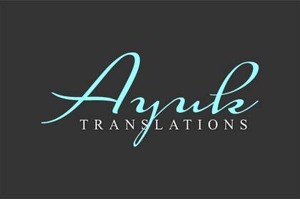
I need a new logo for my new translation firm AYUK TRANSLATIONS. I want the logo to have a vintage feel in terms of lettering. The tagline of my company is "Never out of style." By style, we mean writing style. The tagline does not appear on the logo. I'm just giving you more information so you can understand my company a bit more. We want the logo to be stylish and simple. We basically want another font to be used than the one we have actually. However, we want the AYUK to remain in MINT. AYUK would be on top and TRANSLATIONS is to be at the bottom. We would also need the French version of the logo (TRADUCTIONS AYUK) TRADUCTIONS on top and AYUK at the bottom. AYUK is still in mint. Attached is my infographic CV with the old logo and a screen shot of my Web site (under construction). PLEASE DO NOT ADD IMAGES TO THE LOGO. WE ARE A CREATIVE FIRM. WE WANT TO REMAIN SIMPLE AND CHIC.

Recommended Skills

Employer Feedback

“Great work! I am happy with my new logo.”

Profile image magdaayuk1, Canada.

Public Clarification Board

  • magdaayuk1
    Contest Holder
    • 11 years ago

    Thank you for your entries, everyone! I really appreciate it. I have found a winner!

    • 11 years ago
  • aonedesigners
    aonedesigners
    • 11 years ago

    Check Entry#74

    • 11 years ago
  • handxtend
    handxtend
    • 11 years ago

    #71

    • 11 years ago
  • sunnnyy
    sunnnyy
    • 11 years ago

    hey , pls check #51 , thanx

    • 11 years ago
  • kangfahrur
    kangfahrur
    • 11 years ago

    please give me feedback #42

    • 11 years ago
    1. magdaayuk1
      Contest Holder
      • 11 years ago

      Hi Thank you for your submission. It would be cool if you used a font with a look that is more professional.

      • 11 years ago
  • magdaayuk1
    Contest Holder
    • 11 years ago

    #28 and #33 are closer to my brand image. Both need a few modifications.

    • 11 years ago
  • sunnnyy
    sunnnyy
    • 11 years ago

    hey pls check #16 , thanks

    • 11 years ago
    1. sunnnyy
      sunnnyy
      • 11 years ago

      pls check #19 , thanks

      • 11 years ago
    2. magdaayuk1
      Contest Holder
      • 11 years ago

      Thanks. The font used is not professional enough.

      • 11 years ago
  • lostlast23
    lostlast23
    • 11 years ago

    hello please check #33 Thank you ;)

    • 11 years ago
  • syedafatima1
    syedafatima1
    • 11 years ago

    Please Check #24 and give a valuable feedback. Thanks

    • 11 years ago
    1. syedafatima1
      syedafatima1
      • 11 years ago

      #25

      • 11 years ago
  • Riteshakre
    Riteshakre
    • 11 years ago

    #23 ?

    • 11 years ago
  • kangfahrur
    kangfahrur
    • 11 years ago

    please check number #21 .

    • 11 years ago
  • karlcloy123
    karlcloy123
    • 11 years ago

    Cheack #17, any Feedback's?

    • 11 years ago
  • heenadave
    heenadave
    • 11 years ago

    check #8

    • 11 years ago
    1. magdaayuk1
      Contest Holder
      • 11 years ago

      Hi Thanks for entering the contest! Please read the notes above and look at the new screen shot. Note that the comnpany colours are strictly mint, white and deep grey.

      • 11 years ago
  • magdaayuk1
    Contest Holder
    • 11 years ago

    Something like this font: http://dailydishonesty.com/post/43516172113

    • 11 years ago
  • magdaayuk1
    Contest Holder
    • 11 years ago

    Please view the brief. I have added a new image. It's a screen shot of my Web site(under construction). This way, you can have an idea as to how the logo would fit on the site.

    • 11 years ago
  • magdaayuk1
    Contest Holder
    • 11 years ago

    Hi everyone. Thank you for entering. I would invite everyone to check out this link to have a better idea of what I mean by vintage lettering. https://www.google.ca/search?q=vintage+lettering&hl=en&client=firefox-a&hs=VEU&rls=org.mozilla:en-US:official&tbm=isch&tbo=u&source=univ&sa=X&ei=3M9BUcmBKtKAygHjp4CQDw&ved=0CC8QsAQ&biw=1366&bih=631 I don't want any drawings in my logo. Just words. I would like a vintage handwriting style. AYUK must be written in mint.

    • 11 years ago

Show more comments

How to get started with contests

  • Post your contest

    Post Your Contest Quick and easy

  • Get tons of entries

    Get Tons of Entries From around the world

  • Award the best entry

    Award the best entry Download the files - Easy!

Post a Contest Now or Join us Today!