Graphic Design - Image for Sausage Sizzle
- Status: Closed
- Prize: $150
- Entries Received: 2
- Winner: simsons551

Contest Brief
This Company is multi-faceted. Mostly we are prototype and new product developers. In this case we are marketing a new snack food. The product is a naturally cured and then dehydrated sausage. Two sticks totalling 50g will be packaged in a foil wrapper. T
Recommended Skills
Employer Feedback
“Great job, we were very happy with the results. Would definitely employ again. Thanks!”
![]() aussieproducts, Australia.
aussieproducts, Australia.
Public Clarification Board
-

simsons551
- 12 years ago
thank for help me sir..i got payment today
- 12 years ago
-

Contest Holder - 12 years ago
We have contacted Live Support Online and Jericho says the other half of the payment was delayed but has already been released to you. Let us know if you still haven't received it.
- 12 years ago
-
simsons551
- 12 years ago
its not fine...i will give full zeal in you work ...
- 12 years ago
-
Contest Holder - 12 years ago
You should not post messages like this. We paid the FULL AMOUNT, otherwise they would not have released the work to us, would they? CONTACT FREELANCER SUPPORT about this. We will also contact them.
- 12 years ago
-
simsons551
- 12 years ago
whats this sir....contest prize is $150 and you gave only $75.....
- 12 years ago
-
simsons551
- 12 years ago
sir please rate on my profile
- 12 years ago
-
Contest Holder - 12 years ago
OK freelancers, we have a winner. We are pleased to say that although there was a bit of copying between some designs, all of the work we have chosen is original by the winner. Also we would like to say that ALL of the designs were excellent quality and so we are sorry that there is only one prize. We look forward to working with you all again and GOOD LUCK to everyone. Thanks again Freelancers
- 12 years ago
-
xcerlow
- 12 years ago
Clean appearance?
- 12 years ago
-
Contest Holder - 12 years ago
IMPACT is the keyword, so the most detailed picture may not be the best. Readability is the most important factor, so that customers recognise the product in future. Also, since it is a food product, and the text is now shown as a food item, then the text needs to appear 'edible'... Difficult to explain but we hope that helps.
- 12 years ago
-
simsons551
- 12 years ago
sorry for that but i m not understand that what r u saying in PM...
- 12 years ago
-
Contest Holder - 12 years ago
We like #51 but please move image (sausage/fire) up just a little bit. Thanks
- 12 years ago
-
fuad7sarwar
- 12 years ago
Copy Paste. How can a copy paste idea get 5 star!!!!!
- 12 years ago
-
Contest Holder - 12 years ago
We don't quite understand your objection. How did you get your text? It appears to be the same as #42 and #51. As it happens we most like the clean appearance of #51 and so we are leaning towards that at present. Thanks.
- 12 years ago
-
xcerlow
- 12 years ago
- 12 years ago
-
xcerlow
- 12 years ago
# 78 and #77 need your feedback. sized 190mmx60mm , 300dpi..
- 12 years ago
-

designer78
- 12 years ago
plz check #73,#74.thanks.
- 12 years ago
-
Contest Holder - 12 years ago
Yes, they're good but we think we are now set on a direction which is like the top rated ones. Thanks again for your fresh idea :)
- 12 years ago
-
Contest Holder - 12 years ago
#51 - can you render your text with more sausage realism? Like #66?
- 12 years ago
-
Contest Holder - 12 years ago
#66 - We LOVE the way your text is rendered, please make the text larger and use an image of sausage over fire (no grill or patterns)
- 12 years ago
-
Contest Holder - 12 years ago
#59 and #56 - Thank you for your entries but they do not comply with our design brief - please also see the General Messages on this notice board. #52 is almost exactly what we want unless you have another idea with a lot of visual IMPACT. Thanks again!
- 12 years ago
-
Contest Holder - 12 years ago
#52 is EXCELLENT! Just for comparison please can you make another version of #52 but with the divider and text back to the same colours as in #38 and #42? Thanks again!
- 12 years ago
-
Contest Holder - 12 years ago
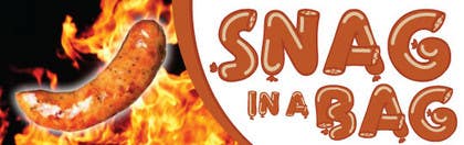
#42 is getting closer to what we need. Great white space! We left #38 there because we love the curved divider between the text side and the image side. We rejected your others because the images were cluttered and/or we weren't keen on the dividers. Can change the following please? Combine #38 and #42 i.e. keep the curved divider as it is in #38, same proportions etc but reverse it i.e. curve from up left to down right. That makes more space at the top for a much bigger word SNAG. Then on next text line have 'in a' and then BAG on next line, but make BAG smaller than SNAG. Justify the text to the right. Regarding the image - photoshop the fork out (gone) and add a background of coals/fire etc. The single sausage looks great, maybe rotate it about 15 degrees clockwise to balance with the divider? A little (just a little) more colour on the text might make it stand out even more? Thanks very much for your work - and to all the other freelancers too. Any more ideas anyone?
- 12 years ago
-
Contest Holder - 12 years ago
GREAT! #38 GOES TO THE TOP BECAUSE WE HAVE TEXT THAT LOOKS LIKE A SAUSAGE! GOOD WORK THANKS. Now we need that text refined and with a different sausage image because designer78 is already using that one. We think one larger sausage would be better than 4 sausages, more like #23 but with an even larger sausage. Thanks.
- 12 years ago
-
Contest Holder - 12 years ago
GENERAL MESSAGE No.2 - Someone could try a cartoon/caricature??
- 12 years ago
-

ProLuka
- 12 years ago
I can! Like my profile picture?
- 12 years ago
-
Contest Holder - 12 years ago
Maybe a happy cartoon sausage?
- 12 years ago
-
xcerlow
- 12 years ago
#31 entry, sized 19mmx60mm ..300dpi ...
- 12 years ago
-
Contest Holder - 12 years ago
Nice effort Thank you. We need a plain white background. Please see the General Message. Thanks again.
- 12 years ago
-

Xzero001
- 12 years ago
made a 3 samples for the texts of mild, original and hot. tell me what you think
- 12 years ago
-
Contest Holder - 12 years ago
Yes, like that. Sausage would need to be bigger if we used text and image but we are pretty set on a modified 3D graphic so please see the General Message we posted. If no-one can do that then we may have to accept a photo image in which case it would be just one big sausage on a char/flame etc Thanks again, they're getting much better!
- 12 years ago
-
BevUK
- 12 years ago
#32
- 12 years ago
View 1 more message
-
ProLuka
- 12 years ago
It's really nice :)
- 12 years ago
-
Contest Holder - 12 years ago
Hi, thanks. #36 has more of the general look we are after. Please see the General Message. Thanks again Bev
- 12 years ago
-
Contest Holder - 12 years ago
GENERAL MESSAGE CONTINUED - Then render the sausage surface using an overlay taken from a photo of a real sausage using a photoshop software or similar package. Then overlay all of that onto an image of cooking coals. The whole of that created image should cover about 50% of the area, the rest should be plain white. We don't want to waste any of your time so if you cannot make something completely original in a 3D package then this may not be for you. However, if you have another really 'different' idea that will have IMPACT, please do show us. We definitely do not want a dark coloured package, it looks like a chocolate package. Thank you all again.
- 12 years ago
-
Contest Holder - 12 years ago
GENERAL MESSAGE - Hi all freelancers. Thanks everyone for your great efforts but we are not seeing what we are looking for. It may be our fault, we may have put this contest in the wrong category. We are looking for some ORIGINAL graphic art work. Just putting some text over a photo of the sausage is not going to have sales impact. Our idea is that you create the sausage (not use a photo) using a 3D software, and make that sausage into the shape of the word SNAG. It should be a fat, continuous sausage, not short or skinny. It's up to you if you twist the continuous or leave it like a long snake... Or several snakes, one for each letter perhaps? MESSAGE TOO LONG - SEE NEXT MESSAGE
- 12 years ago
-
ProLuka
- 12 years ago
Please feedback! Thank you!
- 12 years ago
-
Contest Holder - 12 years ago
Hi, thanks for your entry. Words are too small and not clear to read. Image is not focussed. We want a plain white background. Please see the general message we will post shortly. Thanks
- 12 years ago
-
BevUK
- 12 years ago
please check #36
- 12 years ago
-
ProLuka
- 12 years ago
#32 I aslo made something like logo for your company... Feedback,please. Thank you.
- 12 years ago
-
ProLuka
- 12 years ago
I can make other text (hot hot hot) or i can delete it...
- 12 years ago
-
xcerlow
- 12 years ago
#30 need your feedback!
- 12 years ago
-
xcerlow
- 12 years ago
#28 entry, sized 19mmx60mm ..300dpi
- 12 years ago
-
xcerlow
- 12 years ago
#28 entry, sized 19mmx60mm ..
- 12 years ago
-
designer78
- 12 years ago
plz feedback on #7.thanks.
- 12 years ago
-
Contest Holder - 12 years ago
#14 is better - we like the white background and also the typeface/text colours. Also the 'it's HOT' because we will need a small area on the wrapper for the flavour - HOT, MILD, ORIGINAL etc. Also see our reply to Xzero001 about maybe just one sausage so that it stands out more. The totally plain white background is great, a hint of flame grilling without the metal grill visible would be even better. Thanks!
- 12 years ago
-
designer78
- 12 years ago
thanks for suggestion. i do changes in design try to keep foil.#21.thanks.
- 12 years ago
-
Contest Holder - 12 years ago
#12 is easy to read but it is Snag in 'a' bag, not in 'the' bag. The sausage looks good, we would love to see an entry with a white background and photoshopped sausages forming the word SNAG. Thanks freelancers.
- 12 years ago
-
Xzero001
- 12 years ago
thanx! challenge, accepted
- 12 years ago
-
Contest Holder - 12 years ago
#16 is getting there! Still after a plain white background, maybe one sausage might stand out better than several?? Regarding the text - the word SNAG needs to be large and the other words all small. We don't like the typeface you have used, a softer script would be better, more like #14. We also like the typeface on #8. Your text was better yellow/orange, than red. Thanks again!
- 12 years ago
-
Xzero001
- 12 years ago
i have put an "smokey" effect at the white background on #17 so that the white background is not wasted (but that's my opinion). i'll send another version without the smoke effect.
- 12 years ago
How to get started with contests
-

Post Your Contest Quick and easy
-

Get Tons of Entries From around the world
-

Award the best entry Download the files - Easy!