Design a logo for a vacation rentals company

Contest Brief

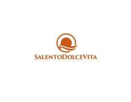
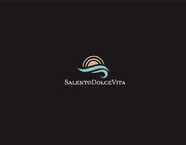
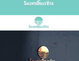
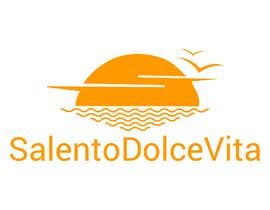
The request is for a logo inclusive of a graphic mark. It will represent the idea of relax/vacation by the seaside and will have a touch of retro while keeping clean lines.

Company name: SalentoDolceVita
Graphic mark: a sun set over smooth sea ripples, not brisk waves. Please see attachment just as an example.

Colors suggestion: white background and tenne (tawny) foreground.

Logo should be essentially single-color, neat and elegant. The graphic mark should include just sea ripples, sun set and the company name. Tip: keep it simple.

The company name has to be considered a single word and it needs to stay on a single line. Font should be simple and classy font, not too curvy. Please avoid script fonts or italics.

Thank you for sending in just clean logo proposals, *** no mock ups ***

Recommended Skills

Employer Feedback

“I enjoyed working with Danila. I chose her logo design because it stood out among 400+ entries. Highly recommended freelancer.”

Profile image raffaeled, Italy.

Top entries from this contest

View More Entries

Public Clarification Board

  • amitdharankar
    amitdharankar
    • 5 years ago

    Not even reviewed anyone's design...not even give suggestions to selected designs by contest holder

    • 5 years ago
  • roohe
    roohe
    • 5 years ago

    you waited for 3 weeks & not waited for 17hours, do you know the value of last day in freelancer, all top designers particape.

    • 5 years ago
    1. mosaddek909
      mosaddek909
      • 5 years ago

      #53

      • 5 years ago
  • mosaddek909
    mosaddek909
    • 5 years ago

    #453

    • 5 years ago
  • roohe
    roohe
    • 5 years ago

    we prepared more than 10concepts for last day & all top designer participate in last day & you have selected before time so sad this is :(

    • 5 years ago
  • raffaeled
    Contest Holder
    • 5 years ago

    *** IMPORTANT ***: The brand name "SalentoDolceVita" needs to be written as a single word, in a single line; please, no word breaks or multiple lines.

    TIP 1: logo mark preferred position is on the left of the brand name, but other proposals are welcome
    TIP 2: Font should not too curvy, preferrably not script or italics.
    TIP 3: keep it simple about the graphic mark.

    Please read carefully the project description before posting.

    • 5 years ago

Show more comments

How to get started with contests

  • Post your contest

    Post Your Contest Quick and easy

  • Get tons of entries

    Get Tons of Entries From around the world

  • Award the best entry

    Award the best entry Download the files - Easy!

Post a Contest Now or Join us Today!