Design a logo for a fast food restaurant stall serving Asian food – fast food concept.
- Status: Closed
- Prize: $200
- Entries Received: 16
- Winner: Dreamscape956


Contest Brief
The restaurant is a small and somewhat artsy food stall serving Asian fast food. See design in attachment.
The name of the stall is “Stray East” - which should also be the logo name. The logo should be in both a round version and in straight text version (like Starbucks also have a round and a straight version -- but don't try to copy Starbucks).
Conceptually the restaurant works like the SUBWAY SANDWICH concept where food is selected by the customer from an open counter behind glass. Customer can put together their meal by selecting one “basic food” (rice, noodle), one type of meat, two types of vegetables, one sauce, one drink.
The food themes of the restaurant are dishes from 5 South East Asian countries (Thailand, Vietnam, Indonesia, India, and Singapore).
The restaurant is planned to be located in China, in the “food streets” located in the basement of a shopping mall, a department store, etc. in China.
The winning entry will be offered the option of a taking on a small additional project, which is to use the new logo to design a name card, a take-away food box, and a paper bag (this project will be further USD 100). Other future projects could possibly be designing menu cards, posters, a website landing page, and so on.
Recommended Skills
Employer Feedback
“Excellent and unique artistic design of logo - super-good freelancer!! Very flexible and friendly, fast response. We are 100% satisfied and will use the services of Dreamscape956 again in the future. Thank you! ”
![]() Petersuzhou, China.
Petersuzhou, China.
Public Clarification Board
-

Contest Holder - 7 years ago
Thank you all for your entries. The competition is now over.
My general comments to all of you is that it is important to read the project brief, and the comments on the clarification board. A lot of the entries missed out on the basic points.
Also, I provided the shop design for you to review before designing a logo - but very few of you seem to have used that as a reference.
Nevertheless, I want to say thank you to all of you for your efforts. Welcome to bid next time again.
Mvh Peter- 7 years ago
-
Contest Holder - 7 years ago
Hi All
- 7 years ago
-

TrezaCh2010
- 7 years ago
- 7 years ago
-

artsdezine
- 7 years ago
Please Check #145 #146 #147 #148
- 7 years ago
-

Ipankey
- 7 years ago
#140
i hope you like :)- 7 years ago
-

cbarberiu
- 7 years ago
One question though - are sticks allowed or not? Indian food does not use sticks so can we use sticks or not?
- 7 years ago
-
Contest Holder - 7 years ago
This is a good question - and I have no answer. Only thing really not allowed is to create a feeling of Western, Japanese, or Chinese food --- because this restaurant is exactly all about offering an ALTERNATIVE to these types of foods, which dominate every food street in China. Thank you for the question
- 7 years ago
-
cbarberiu
- 7 years ago
ok, that clarifies enough I think, thank you!
- 7 years ago
-
cbarberiu
- 7 years ago
new version #125 thanks!
- 7 years ago
-
cbarberiu
- 7 years ago
Hi, please check my entry #100 feedback is welcome, thank you!
- 7 years ago
-
Contest Holder - 7 years ago
Thank you for your entry. I see you have really tried hard with this one. There are two things that made me reject it. First, it gives a Chinese feeling (dragon head). But note, that although this restaurant is located in China, it will distinguish itself away from Chinese food, and instead position itself as "Asian Food" from 5 countries, not including China (India, Vietnam, Indonesia, Thailand, and Singapore). The second thing that caused me to reject it is the sharp deep red color mixed with the sharp yellow (like Mac Donalds, and even the Chinese flag). I feel it does not align well with the shop design which is mainly in pastel colours. I hope this feed back is useful, and wish to thank you again for your entry
- 7 years ago
-
cbarberiu
- 7 years ago
Thank you for the feedback - now it is clearer for me. I was under the impression that you want the chinese feel to dominate - so in fact you want a mixture of all these feels in your logo, none of the following: Chinese, Japanese, Vietnamese, and the others should dominate. This is what I understand now - with this in mind and the colour details I will try to make up something new. Thanks a lot, feedback is constructive!
- 7 years ago
-

foisalahamed82
- 7 years ago
sir,please look at #117,#118,#119
- 7 years ago
-

AESSTUDIO
- 7 years ago
Please Check : #105 #106 #107
- 7 years ago
-

katrybalko18
- 7 years ago
Entry #104
- 7 years ago
-
katrybalko18
- 7 years ago
Entry #86
- 7 years ago
-
Ipankey
- 7 years ago
#66 i hope you like it :)
- 7 years ago
-
Contest Holder - 7 years ago
Thank you for the entry. You got the chopsticks right - and the elements inside the mark are quite ok. But the image base (red sun on white background) resembles the Japanese flag. The restaurant will not serve Japanese food, and the logo must not mislead the consumer to believe that there is Japanese food served there. Please read my comments on the clarification board
- 7 years ago
-
Ipankey
- 7 years ago
Should use red and white ?????
- 7 years ago
-
Ipankey
- 7 years ago
#67 check
feedback please :)- 7 years ago
-
Contest Holder - 7 years ago
I found one issue that I would like to address. There is quite a big difference between South East Asian food and Japanese food. Although Japanese food is very popular in China, this food stall is only focusing on Thai, Indian, Vietnamese, Singaporean and Indonesian food. Some of the entries are in Japanese style. What I mean by "Japanese style" is fonts, type of chopsticks, and the combination of red and white colors.
- 7 years ago
View 1 more message
-

kaytwo
- 7 years ago
could you please feedback my entry #49
- 7 years ago
-
katrybalko18
- 7 years ago
Entry #55
- 7 years ago
-

midodesigner1
- 7 years ago
check #39 i think it is better now yes ?
- 7 years ago
-
Contest Holder - 7 years ago
Thank you for your entry. There is a problem here - you use Japanese characters and Japanese chopsticks (please read my comments on the clarification board). While the design is lively, the overall feeling is not in harmony with the stall design.
- 7 years ago
-

farzana1994
- 7 years ago
please check #43, #44, #45 & #46.
- 7 years ago
-
taseesawan55
- 7 years ago
Can you please check #40 for a while please.
Thanks- 7 years ago
-
midodesigner1
- 7 years ago
check #22 an tell me if i can add something
- 7 years ago
-
Contest Holder - 7 years ago
Thank you for your entry. You use a hamburger and a fork in the logo you made. But there will be no hamburgers on the menu in the food stall - it is purely Asian food. I somehow associate hamburgers with western food. Also, I prefer chopsticks over knife and fork (if at all to be used in the logo), as that gives a more Asian feeling. I hope this answer is useful.
- 7 years ago
-
Contest Holder - 7 years ago
I followed your recommendation and have rejected some of the logos. Even though I reject now, I will review all relevant entries together with my colleagues on October 13 before making final decision. Basically what I reject is what I think will not match well with the design of the stall design and colors and the style.
- 7 years ago
-
Contest Holder - 7 years ago
Thank you for questions. The Chinese name is 流浪东南亚 (pronounced "Liu Lang Dong Nan Ya")
- 7 years ago
-

gerardguangco
- 7 years ago
please review #21 thanks
- 7 years ago
-
gerardguangco
- 7 years ago
please review #17 thanks
- 7 years ago
-
Contest Holder - 7 years ago
Welcome to all contestants!
Please consider that there is also a Chinese name that should work well in conjunction with the logo (5 Chinese characters).- 7 years ago
-
cbarberiu
- 7 years ago
Hi! Can you provide the chinese name too, to be included in the logo, (underneath, above, somewhere). You could provide the outlines of the Chinese characters to be used for instance.
- 7 years ago
-

desoja
- 7 years ago
Hi CH ! Please check #9 and #15 . Please rate or reject entries as it gives better idea to improve and modifications. Thanks.
- 7 years ago
-
Contest Holder - 7 years ago
Thank you all of you who are working on this. A 100% key issue is that the logoincorporates the theme (asian food), as well as respect the design and colours of the food stall. Colours do not have to be the same as in the food stall, but must at least be compatible. For example a blue logo on a black wall will not be considered.
- 7 years ago
-
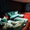
Contest Holder - 7 years ago
Yes - this is the exact stall where the logo will be used. It is not so important that you fix your suggestion on to the stall --- but it is VERY important that the logo is in full harmony with the stall design.
- 7 years ago
-
Contest Holder - 7 years ago
Thank you for asking the question by the way.
- 7 years ago
-

sanayafariha
- 7 years ago
check #1 and #2
- 7 years ago
How to get started with contests
-

Post Your Contest Quick and easy
-

Get Tons of Entries From around the world
-

Award the best entry Download the files - Easy!