Design a Flyer/Poster for a Mountain Adventure Event
- Status: Closed
- Prize: $200
- Entries Received: 50
- Winner: amaydualk

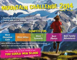
Contest Brief
We need a flyer designed to be printed on 8.5" x 11" paper to advertise an event entitled Mountain Challenge 2014. The copy has already been written. The end result will need to be delivered in a fully editable format (Adobe Illustrator or other Adobe product is preferred). All components of the final deliverable file must be easily editable with appropriate software, as details of this event may change before printing. The final deliverable must also be in a high resolution (min 300dpi) for glossy printing at 8.5" x 11" printed size.
This event is still in concept phase, and the website does not yet exist. Ideas for images are attached below - I do not have rights to use those particular images. In addition to the photo ideas, I have attached versions of the logo for the organization that will benefit from the event (Center for Snow & Avalanche Studies). One of those logos will need to be used (probably towards bottom of flyer/poster) with the text: Benefiting the Center for Snow & Avalanche Studies
Text for Flyer/Poster:
Mountain Challenge 2014
June 15 - 30
1. Run/Hike in the Mountains between June 15-30, 2014
2. Track it with GPS or Satellite
3. Follow your Competitors online
Compete for:
Most Elevation Gain
Most Miles
Most Summits
Best Photos
Best Family Adventures
Prizes awarded by Age Class, Gender, Individuals & Teams
You could win $1,000!
Where:
Mountains of your Choice
Registration: $99 (Limited to 500 Participants)
Optional: Rent a Spot Gen3TM with Unlimited Tracking: $99
Benefiting the Center for Snow & Avalanche Studies
MountainChallenge2014.com
Recommended Skills
Employer Feedback
“Designed the best poster of over 50 entries. Her concept was excellent and worked hard through many revisions to perfection. She packaged all editable Illustrator files along with print-ready files.”
![]() kimsilverton, United States.
kimsilverton, United States.
Public Clarification Board
-

SebaComun
- 10 years ago
congrats to the winner! at least I was using the correct picture haha :D
- 10 years ago
-

Contest Holder - 10 years ago
You're designs were a close 2nd place. Thank you for all your efforts! I will certainly contact you next time I have a design project.
- 10 years ago
-

gkinnamon
- 10 years ago
Hello,
Somewhat of a last-minute entry #54 . Please let me know if you have any suggestions.
Thanks for the fun contest.- 10 years ago
-

rajkumar9871
- 10 years ago
hi sir please check and feedback my design #48. thanks
- 10 years ago
-

marcia2
- 10 years ago
any comments for #22 ?
- 10 years ago
-

lindoro
- 10 years ago
Hi!
I hope you like my design #30 (Background Picture Quality is of course not final - concept version)
Greetings from Austria!- 10 years ago
-
Contest Holder - 10 years ago
Thank you for your designs. I am afraid I don't like white boxes around the text - too distracting for me.
- 10 years ago
-
rajkumar9871
- 10 years ago
hi sir feedback entry #12. thanks
- 10 years ago
-
rajkumar9871
- 10 years ago
hi sir please check my entry #12 and feedback. thanks.
- 10 years ago
-
Contest Holder - 10 years ago
The Center for Snow and Avalanche Studies logo should be small at the bottom. That is the charity that this event is helping, but they are not really what the event is about.
- 10 years ago
-
rajkumar9871
- 10 years ago
hi sir please check my entry #14 and feedback. thanks.
- 10 years ago
-
Contest Holder - 10 years ago
too much white space/dead space
- 10 years ago
-
SebaComun
- 10 years ago
Hi! Let me know ehat you think about #17 . Cheers!
- 10 years ago
-
Contest Holder - 10 years ago
I like the background photo. I don't especially like "curly" script font for the title. I don't like the "boring" guy looking at the computer - perhaps an image with GPS tracks on a map would be better. I Do like the "Compete for" list in the lower left corner.
- 10 years ago
-
rajkumar9871
- 10 years ago
hi sir please check my entry and feedback #12, #14. thanks
- 10 years ago
-

moorekk1
- 10 years ago
#24 Hello, thank you for another chance...:) Please, if you don't mind .. take a look at it.
- 10 years ago
-
Contest Holder - 10 years ago
Thank you for your entries. I would like a design that feels more unified - I don't like the use of small photos. For the text, finding a way to make it not so long lists is helpful.
- 10 years ago
-

paramiginjr63
- 10 years ago
Please check and feedback #27 . Thanks.
- 10 years ago
-
Contest Holder - 10 years ago
I love the bold fonts. I would prefer a more colorful photo.
- 10 years ago
-

dindinlx
- 10 years ago
HOW ABOUT MINE SIR #26
- 10 years ago
-
Contest Holder - 10 years ago
I prefer larger photographs - possibly just using 1 image or 2.
- 10 years ago
-
dindinlx
- 10 years ago
need feedback please #26
- 10 years ago
-
moorekk1
- 10 years ago
#25 thank you for the feedback.
- 10 years ago
-

amaydualk
- 10 years ago
Hi. Please check #8 . Thank you.
- 10 years ago
-
amaydualk
- 10 years ago
Please let me know your comments. Thank you.
- 10 years ago
-
Contest Holder - 10 years ago
I like it a lot!! - I sent you a message.
- 10 years ago
-
moorekk1
- 10 years ago
#2 Please give me feedback. Thanks in advance!:)
- 10 years ago
-
Contest Holder - 10 years ago
I must admit that there are other designs I like better. This one has too much "dead" space, not enough unity for my personal taste. You are welcome to try another approach.
- 10 years ago
-

nikster08
- 10 years ago
Hi, any feedback and rating would be great on #3 & #4 . Thanks.
- 10 years ago
-
Contest Holder - 10 years ago
Nikster - Thanks for being so quick! I like #4 better, but the brown box is a little too dominant for my taste. I'm hoping for something brighter/more inviting. I realize this is hard with so much text. I absolutely love the font for Mountain Challenge title - that is my favorite part. By the way, the TM after Gen3 should be superscript (that can be fixed later).
- 10 years ago
-
Contest Holder - 10 years ago
Nikster - not sure why my message cam out that way. I will try again: I like 4 better than 3. I LOVE the Mountain Challenge font. I don't much like the big brown box - too dominant. I would like something brighter and more inviting, though I know that is a tough one with so much text. By the way, the TM after Gen3 should be superscript (it is for Trademark).
- 10 years ago
-

davidsarbah
- 10 years ago
check out 5 and 6 ,thank you.
- 10 years ago
-
Contest Holder - 10 years ago
David - Your #6 entry is definitely the BEST entry so far! I love the colors and everything about it. FYI - the TM after Spot Gen3 should be superscript (that can be fixed later). My one worry is that I have not purchased rights for those photos. Do you know a source for free or "cheap" photos that would work? Otherwise, I will be willing to pay for these (they came from Getty Images). Kim
- 10 years ago
-
Contest Holder - 10 years ago
Thank you! I look forward to seeing it. I am hoping it will appeal to adventurous outdoor athletes and families.
- 10 years ago
-

wbengelbrecht
- 10 years ago
Dear Client. I am going to start working on your project and will deliver my sample in 2 days. Regards Lina
- 10 years ago
How to get started with contests
-

Post Your Contest Quick and easy
-

Get Tons of Entries From around the world
-

Award the best entry Download the files - Easy!