Change logo color from red to gold

  • Status: Closed
  • Prize: €10
  • Entries Received: 149

Contest Brief

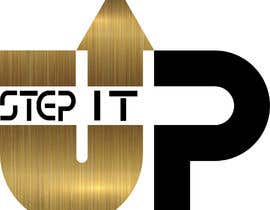
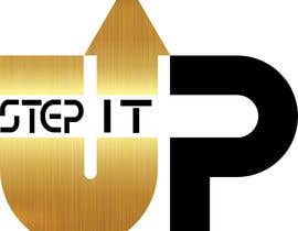
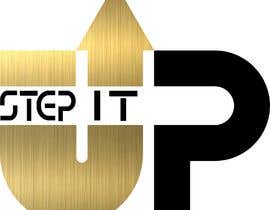
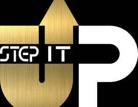
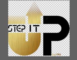
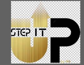
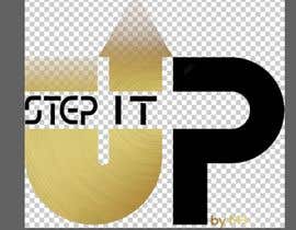
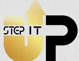
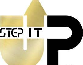
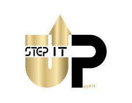
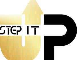
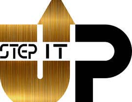
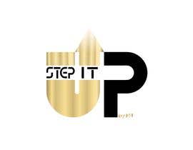
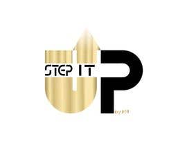
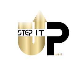
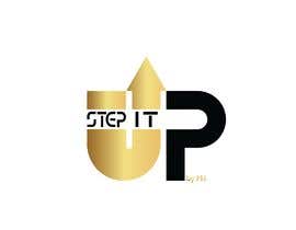
Hi My name is Martin and Im high end personal trainer.

I am looking for a more luxury look of my logo. I want exactly the same logo just with gold/ champagne instead of the red. Attached you have the logo and can see what kind of deep champagne/ gold color i am looking for. The color should be metallic and glittery.

Recommended Skills

Top entries from this contest

View More Entries

Public Clarification Board

  • AfzlDesign
    AfzlDesign
    • 5 years ago

    Hello Sir #167 is New design if you check it..it's your full need ....I will make the design after see you all reply . i hope that 3167 will fulfill your all need. kindly check

    • 5 years ago
  • AfzlDesign
    AfzlDesign
    • 5 years ago

    Hello Sir #167 is New design if you check it..it's your full need

    • 5 years ago
  • AfzlDesign
    AfzlDesign
    • 5 years ago

    Hello Sir #165 is New design if you check it..it's your full need

    • 5 years ago
  • AfzlDesign
    AfzlDesign
    • 5 years ago

    #167 is New design if you check it

    • 5 years ago
  • AfzlDesign
    AfzlDesign
    • 5 years ago

    #165 is New design if you check it

    • 5 years ago
  • AfzlDesign
    AfzlDesign
    • 5 years ago

    Please check #165 #164

    • 5 years ago
  • efecanacis
    efecanacis
    • 5 years ago

    CHECK #161 its 3d logo

    • 5 years ago
  • rohitnav
    rohitnav
    • 5 years ago

    Please check #160 . Thanks

    • 5 years ago
  • EmirAhmetspahic
    EmirAhmetspahic
    • 5 years ago

    #152

    • 5 years ago
  • EmirAhmetspahic
    EmirAhmetspahic
    • 5 years ago

    #151

    • 5 years ago
  • rohitnav
    rohitnav
    • 5 years ago

    Please check #148 , #149 . Thanks..

    • 5 years ago
  • MostafaMagdy23
    MostafaMagdy23
    • 5 years ago

    check #145

    • 5 years ago
  • shemulahmed210
    shemulahmed210
    • 5 years ago

    Please cheek #140 .

    • 5 years ago
  • EmirAhmetspahic
    EmirAhmetspahic
    • 5 years ago

    #129 #130 Thanks

    • 5 years ago
  • paramaconic
    paramaconic
    • 5 years ago

    Please check 126

    • 5 years ago
  • rohitnav
    rohitnav
    • 5 years ago

    Please check #121 . Thanks

    • 5 years ago
  • Maryadipetualang
    Maryadipetualang
    • 5 years ago

    please check #115

    • 5 years ago
  • shemulahmed210
    shemulahmed210
    • 5 years ago

    Please cheek my entry, #96 , #97 , #98 , #99 , #100 . Thanks.

    • 5 years ago
  • LimLim96
    LimLim96
    • 5 years ago

    #93 new update.

    • 5 years ago
  • LimLim96
    LimLim96
    • 5 years ago

    Please check #77 i've created 2 more...

    • 5 years ago
    1. LimLim96
      LimLim96
      • 5 years ago

      #80 new update

      • 5 years ago
  • sigmadevelopers
    sigmadevelopers
    • 5 years ago

    Hi,

    Kindly check #78 and let me know the review please

    Thanks

    • 5 years ago
    1. sigmadevelopers
      sigmadevelopers
      • 5 years ago

      Kindly let me know the issues?

      • 5 years ago
  • sigmadevelopers
    sigmadevelopers
    • 5 years ago

    I have seen the attached images.You don't want to touch black area?Just want to change the red area with metallic gold?

    • 5 years ago
    1. hegnamartin
      Contest Holder
      • 5 years ago

      Thats right

      • 5 years ago
    2. hegnamartin
      Contest Holder
      • 5 years ago

      If you see I like 8, 13 and 24. They have that "aluminium stripe look" that makes it good. The stripes could be more visible/ more raw and the fading should be ONLY on the arrow of the "U"

      • 5 years ago
  • efecanacis
    efecanacis
    • 5 years ago

    Do you want any changes? Just message me...

    • 5 years ago
    1. hegnamartin
      Contest Holder
      • 5 years ago

      If you see I like 8, 13 and 24. They have that "aluminium stripe look" that makes it good. The stripes could be more visible/ more raw and the fading should be ONLY on the arrow of the "U"

      • 5 years ago
  • designgale
    designgale
    • 5 years ago

    done please check #11

    • 5 years ago
    1. hegnamartin
      Contest Holder
      • 5 years ago

      If you see I like 8, 13 and 24. They have that "aluminium stripe look" that makes it good. The stripes could be more visible/ more raw and the fading should be ONLY on the arrow of the "U"

      • 5 years ago
  • shinshushko
    shinshushko
    • 5 years ago

    please check #21 #17 #12

    • 5 years ago
    1. hegnamartin
      Contest Holder
      • 5 years ago

      If you see I like 8, 13 and 24. They have that "aluminium stripe look" that makes it good. The stripes could be more visible/ more raw and the fading should be ONLY on the arrow of the "U"

      • 5 years ago
  • Maryadipetualang
    Maryadipetualang
    • 5 years ago

    please check #25

    • 5 years ago
    1. hegnamartin
      Contest Holder
      • 5 years ago

      If you see I like 8, 13 and 24. They have that "aluminium stripe look" that makes it good. The stripes could be more visible/ more raw and the fading should be ONLY on the arrow of the "U"

      • 5 years ago
  • nayan007009
    nayan007009
    • 5 years ago

    please check #38 , #42 , #43 , #45

    • 5 years ago
    1. hegnamartin
      Contest Holder
      • 5 years ago

      If you see I like 8, 13 and 24. They have that "aluminium stripe look" that makes it good. The stripes could be more visible/ more raw and the fading should be ONLY on the arrow of the "U"

      • 5 years ago
  • nayan007009
    nayan007009
    • 5 years ago

    Please Check #47 , #48

    • 5 years ago
    1. hegnamartin
      Contest Holder
      • 5 years ago

      If you see I like 8, 13 and 24. They have that "aluminium stripe look" that makes it good. The stripes could be more visible/ more raw and the fading should be ONLY on the arrow of the "U"

      • 5 years ago
  • IamEzio
    IamEzio
    • 5 years ago

    check #59 I think that's what you were looking for.

    • 5 years ago
    1. hegnamartin
      Contest Holder
      • 5 years ago

      If you see I like 8, 13 and 24. They have that "aluminium stripe look" that makes it good. The stripes could be more visible/ more raw and the fading should be ONLY on the arrow of the "U"

      • 5 years ago
  • rohitnav
    rohitnav
    • 5 years ago

    Please check #64 , #65 . Thanks

    • 5 years ago
    1. hegnamartin
      Contest Holder
      • 5 years ago

      If you see I like 8, 13 and 24. They have that "aluminium stripe look" that makes it good. The stripes could be more visible/ more raw and the fading should be ONLY on the arrow of the "U"

      • 5 years ago
  • hegnamartin
    Contest Holder
    • 5 years ago

    If you see I like 8, 13 and 24. They have that "aluminium stripe look" that makes it good. The stripes could be more visible/ more raw and the fading should be ONLY on the arrow of the "U"

    • 5 years ago
  • designgale
    designgale
    • 5 years ago

    you want whole logo in gold or just red part convert in gold?

    • 5 years ago
    1. hegnamartin
      Contest Holder
      • 5 years ago

      Just change the red for gold

      • 5 years ago
  • king1432001
    king1432001
    • 5 years ago

    sir what is job of you company and the name pls

    • 5 years ago
    1. hegnamartin
      Contest Holder
      • 5 years ago

      Personal trainer and Step it UP.

      • 5 years ago
  • arnob777s
    arnob777s
    • 5 years ago

    please attach your file/logo

    • 5 years ago
    1. hegnamartin
      Contest Holder
      • 5 years ago

      Sorry. Now the logo and the idea of the new color is added.

      • 5 years ago
    2. designgale
      designgale
      • 5 years ago

      ok sir thanks

      • 5 years ago

Show more comments

How to get started with contests

  • Post your contest

    Post Your Contest Quick and easy

  • Get tons of entries

    Get Tons of Entries From around the world

  • Award the best entry

    Award the best entry Download the files - Easy!

Post a Contest Now or Join us Today!