ps31sabharwal
India

I'm just starting out in a new business, and have just had a logo design completed, based on a brief I prepared. There are many things I like about it, but I've just come across another look / approach I think might work better. My company name is Creativer and I provide creative thinking trainng and workshops to corporate clients in Asia. I help teams learn and implement creative thinking processes and tools to enable the whole team to collaborate more creatively.
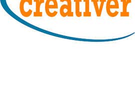
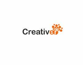
I'm attaching the current logo design as well as an alternative style I saw that might work. (Of course the word should be changed to Creativer) Can you come up with something based on the "creativer alternative look"?
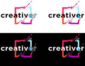
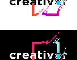
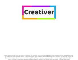
What about this alternative look do I want to highlight? The process I follow has four elements to it (see the square and circle that have four colours). The circle or square option works because it is a process, as well as a frame or way of looking at things. The design has the pop of colour but it is contained (easier for reproducing later as I need to do training materials, notebooks, videos etc).
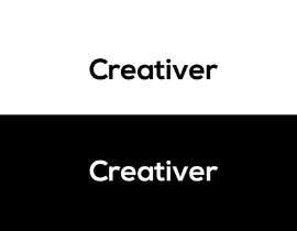
Please share your idea both how it would look on white background and on black background. This is a very quick exercise to determine whether to stay with the current or drop it and move with a new design, so a quick response is needed.
Hey thanks for reading, I really appreciate it! I hope you will bring your amazing creative talent to this challenge! And maybe, just maybe, there is a cracking new logo that represents me and what I offer in an even stronger way!
“It was a pleasure working with Prateek. He took time to understand the brief and check with me, and was super responsive. High recommend!”
![]() laratruelove, Singapore.
laratruelove, Singapore.


Post Your Contest Quick and easy

Get Tons of Entries From around the world

Award the best entry Download the files - Easy!