Minimal Logo Eyeglass Design - Turn Letters C, H, O into Glasses

  • Status: Closed
  • Prize: $100
  • Entries Received: 54
  • Winner: gilart

Contest Brief

I am looking to complete a project I already started. I have been designing a logo for a company called "FRENCH OPTICAL". Please read the contest rules and follow specific instructions and feel free to ask me any clarifying questions.

1) Even though the name of the company is FRENCH OPTICAL, there is nothing FRENCH about the company. Do NOT include any images having to do with France.

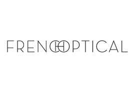
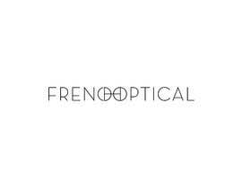
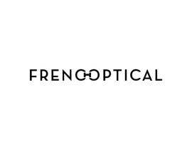
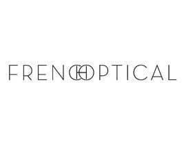
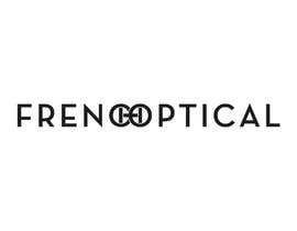
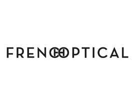
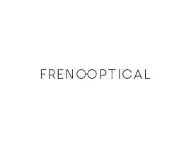
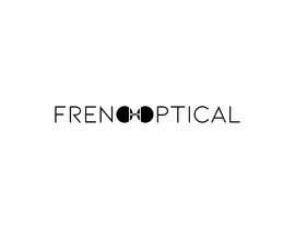
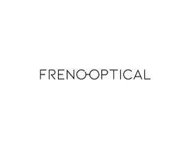
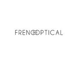
2) In the following attached Illustrator file you see the word FRENCH OPTICAL. In the middle of the font, I have combined the letters C,H, & O to form a minimal pair of eyeglasses that does not distract from the rest of the logo. The font used in Neutra Display Bold, 18pt.

3) The "problematic" is that the words read closer to, F R E N O O P T I C A L, rather than, F R E N C H O P T I C A L. This contest is to see if anyone can combine the 3 letters, C,H, & O so that the logo reads as, F R E N C H O P T I C A L. This is not a easy task.

4) Your entries must keep the color of the font/logo Black on a transparent background. Color space for font color is Black RGB, 000000. Font must be 18pt on a document size of 241px X 162px. Please download the attached Illustrator file. Do not change the font size or document space.

5) Changes that are allowed include:
- Preference will be given to designs that use the Neutra Display font but other fonts may be substituted if the font is better suited to the task. Adjustments to the font sizes may be made as long as it is proportional to the original 18pt font size.
- A Gray color may also be used in the design for those that want to work with negative space. Please use only Gray RGB, 888888.

6) All entries must be vector files and editable in Adobe Illustrator.

Please follow these contest rules exactly. I would like every entry to have a uniform look and I would like to see design skills at the purest level. Please keep entries as minimal as possible. The winning entry will most likely be the most simple.

All entries will be public. At the end of the contest, if two or more designs are similar, the winning design will be the design submitted the earliest.Thank you for browsing this contest.

Recommended Skills

Employer Feedback

“Thank you Luis. Your winning entry was well deserved. Good luck in future. All the Best, David”

Profile image davidhunternyc, United States.

Top entries from this contest

View More Entries

Public Clarification Board

  • davidhunternyc
    Contest Holder
    • 6 years ago

    I am about to choose the winning design. There are several 4 star designs here. I am choosing this winner not because I think it is better than the other 4 star entries but because it was the most creative and most simple interpretation of my description. It was a design I did not think of before I started this contest. Like I said, I am interested in purchasing several other designs here and I would like see where your other designs take me. Please make sure that all your logos are in vector format. With that said, congratulations to entry #389 . Your winning entry is well deserved. Thank you. I also want to say a special thank you to Arif M. You were relentless with this contest and your designs are top notch. It was tough not awarding you the top prize. And Anika T., your spirit and determination amazed me. Thank you. To everyone else responsible for 615 entries, I want to thank you also for all of your hard work. I am grateful. I hope we can all meet again in the future.

    • 6 years ago
    1. anikatasnim05
      anikatasnim05
      • 6 years ago

      Thanks You so much . Always respect your decision

      • 6 years ago
  • davidhunternyc
    Contest Holder
    • 6 years ago

    Thank you again. I am studying the top entries carefully and will let you know who the winner is soon. There are several entries with just minor differences. If I do not choose your entry as the winner, please do not be discouraged. I am interested in purchasing several of these top entries.

    • 6 years ago
    1. anikatasnim05
      anikatasnim05
      • 6 years ago

      Always Respect your Decision . Thanks And Regards Anika

      • 6 years ago
  • davidhunternyc
    Contest Holder
    • 6 years ago

    Thank you all for entering this contest! Please vote for your favorite design below. Do NOT vote for your own design.

    • 6 years ago
    1. samirrahman21
      samirrahman21
      • 6 years ago

      VOTE FOR #556 .CAUSE SHE MAINTAINED ALL OF YOUR REQUIREMENT. Best Of Luck For Her.

      • 6 years ago
    2. noyonmailbox007
      noyonmailbox007
      • 6 years ago

      I have lose time for submit my design, but overall #556 is best one, i prefer and recommend this design. This is good looking and modern design.

      • 6 years ago
  • eliartdesigns
    eliartdesigns
    • 6 years ago

    #389 i like

    • 6 years ago
  • davidhunternyc
    Contest Holder
    • 6 years ago

    With just an hour left, I need your help. There are many excellent designs but I can not decide the winning entry. Please vote for your favorite 4 star design here. Simply reply by typing in, #100, for example. Do NOT vote for your own design. Thank you.

    • 6 years ago
    1. zhejr
      zhejr
      • 6 years ago

      They all look alike and all read "frenooptical". You need some awesome imagination or dyslexia to read it as "french". But don't trust my judgement do a poll and ask your friends and family to read it. Claudio had good idea with #543 , but glasses remind of dumbbell too.

      • 6 years ago
    2. Maritu92
      Maritu92
      • 6 years ago

      #389

      • 6 years ago
  • davidhunternyc
    Contest Holder
    • 6 years ago

    Please make sure all entries are vectors, .ai files. No .jpeg. No .png. Only vectors. Thank you.

    • 6 years ago
  • davidhunternyc
    Contest Holder
    • 6 years ago

    Thank you all for your entries. During these last couple of days I am going to study all the 4 star and 3 star entries yet again. I will most likely elevate several 3 star entries into the 4 star category. I will also write to several of these entries asking to refine certain ideas. Hopefully a 5 star entry will result. Because I'm torn between several excellent entries, I have not awarded any 5 star entries yet. There is still time to enter into this contest. Do not be discouraged. Make sure all entries are using a black font on a white transparent background. Make sure all entries are in the .svg format. Your entries must be vectorized. Even though I must choose a winning entry I may want to purchase several more entries. Many of your entries look promising. Thank you.

    • 6 years ago
  • davidhunternyc
    Contest Holder
    • 6 years ago

    With only 4 days remaining, I need to get serious about choosing the winning entry. I am still hoping the best is yet to come, however. Please, continue to submit designs.

    • 6 years ago
  • davidhunternyc
    Contest Holder
    • 6 years ago

    Thank you for your continued entries. I am trying my best to give feedback to everyone. Also, please keep your entries simple; black letters on plain white transparent background. No special effects. No black backgrounds. No colors. Thank you.

    • 6 years ago
    1. kareenay
      kareenay
      • 6 years ago

      #436 #437

      • 6 years ago
    2. chyonislam
      chyonislam
      • 6 years ago

      please check #438

      • 6 years ago
  • imcopa
    imcopa
    • 6 years ago

    please check #434

    • 6 years ago
  • davidhunternyc
    Contest Holder
    • 6 years ago

    I just gave entry #395 a 3 star rating. It is super sleek and minimal. The font is a bit different too.

    • 6 years ago
    1. anikatasnim05
      anikatasnim05
      • 6 years ago

      please check #407 and #408 . i make the CHO letter more like Glasses. please provide a feedback for the concepts .Regards Sir

      • 6 years ago
    2. anikatasnim05
      anikatasnim05
      • 6 years ago

      Entry #427 please check this all new concept sir

      • 6 years ago
  • krained
    krained
    • 6 years ago

    i see a binocular

    • 6 years ago
  • davidhunternyc
    Contest Holder
    • 6 years ago

    I awarded entry #389 the first 4 star design. This logo addresses all of my concerns in the original description in a clean, elegant, and minimal manner. I don't see how this particular design could be improved. Most importantly, this entry was inventive. He thought outside of the box and presented the Neutra Display font without the usual, distracting four slices in the H. Thank you.

    • 6 years ago
    1. davidhunternyc
      Contest Holder
      • 6 years ago

      Please, everyone, continue to be inventive. Do not copy other designs in the contest. There is still plenty of time to design a winning entry. Don't feel discouraged. This is a difficult and exacting contest and I'm trying my best to comment on your entries. Thank you.

      • 6 years ago
  • davidhunternyc
    Contest Holder
    • 6 years ago

    Hello everyone. Thank you for your continued entries. I know that some designers are getting frustrated. I get you. I really do. I have been working on this logo here for 6 months and the owner of the business is never happy. I am trying to direct this contest the best I can. Don't be discouraged if I reject your designs immediately. At this point, I need no more entries with the Simplifica font. I already made up my mind the two best entries with these submissions.

    • 6 years ago
    1. davidhunternyc
      Contest Holder
      • 6 years ago

      I have one week remaining. I am really looking for someone to pull a magic trick out of a hat. There are two really encouraging entries. Both entries are thinking out of the box. Check out entry #352 and #336 . Both entries are different and I have not thought about this configuration before. #356 is only the fourth 3 star design. It needed to be loaded up as the logo only and not in two parts. There are minor other issues as well but, please, do you see how the description doesn't have to be a dead end? We do not need to see the same 4 slices with the Neutra Display font to form the H. Please, continue to invent. The second impressive entry only received 2 stars. Entry #336 . It's an excellent beginning of an idea. It's not fully formed yet hence why I gave it 2 stars. This entry also makes use of the negative space which doubles as the H and the glasses. It's blocky, hard-edged, and angular. Not soft and elegant. But it's a great idea. It's the beginning of something different.

      • 6 years ago
  • Tamim002
    Tamim002
    • 6 years ago

    #359

    • 6 years ago
  • Tamim002
    Tamim002
    • 6 years ago

    #358

    • 6 years ago
  • digisohel
    digisohel
    • 6 years ago

    #357 , Please Check

    • 6 years ago
  • digisohel
    digisohel
    • 6 years ago

    #354 , Please Check

    • 6 years ago
  • davidhunternyc
    Contest Holder
    • 6 years ago

    Also, there are only three, 3 star designs so far. #256 , #290 , & #296 . All these entries use the SIMPLIFICA font. I do not think that these three designs can be improved using this font in the manner that it has so far. Any new entries that are too similar to these three designs will be rejected. I will consider designs that use the SIMPLIFICA font but the changes must be more significant. Like I said earlier, I am still giving priority to the NEUTRA DISPLAY font. I would like to see other elegant, clean, minimal font designs also. Thank you.

    • 6 years ago
    1. anikatasnim05
      anikatasnim05
      • 6 years ago

      #310 please check this entry sir. Every letter of the logo Is custom made Expected T AND I letter. Please Provide Feedback sir . Thanks and Regards Anika

      • 6 years ago
    2. digisohel
      digisohel
      • 6 years ago

      #354 , Please Check

      • 6 years ago
  • gilart
    gilart
    • 6 years ago

    Please check #352.

    • 6 years ago
  • davidhunternyc
    Contest Holder
    • 6 years ago

    Also, again, please upload only one design at a time. Do not upload 2 or more designs at one time. This way every design can be carefully considered and commented on specifically. Please keep the logo black on a transparent white background. Areas of gray can be used as stated in the description. Thank you.

    • 6 years ago
    1. anikatasnim05
      anikatasnim05
      • 6 years ago

      Thank you so much . It looks lots of effort to do .

      • 6 years ago
  • davidhunternyc
    Contest Holder
    • 6 years ago

    These are the critical areas that make logo #256 worthy of consideration. The font and design are simple and clean. Here's why:

    1)The C,H, & O are clearly visible.
    2) The eyeglasses are clearly visible.
    3) The C in FREN'C'H is the same C in OPTI'C'AL and was not altered in any way to form the H.
    4) The O in 'O'PTICAL is simply a reversed C.
    5) The negative space (4 slices) around the H is the same thickness as the font so there are no distractions.
    6) The negative space (4 slices) around H anchor the nose pads on the bridge: the H.
    7) The H is not altered in any way. No awkward curves.
    8) The thin font with ample negative space make the logo elegant and breathable.
    9) The logo is subtle.

    • 6 years ago
    1. salimbargam
      salimbargam
      • 6 years ago

      the glasses not look like a glasses I had the same idea first of all but I thought that the eyeglasses look something diferent

      • 6 years ago
    2. davidhunternyc
      Contest Holder
      • 6 years ago

      Yes, if there is a fault with the Simplifica font, the glasses do not quite look like glasses. The lenses are too tall and narrow. Maybe if the font were compressed down vertically a bit it would look better?

      • 6 years ago
  • davidhunternyc
    Contest Holder
    • 6 years ago

    For those people concerned about hijacking other peoples designs, I clearly stated in my description: "At the end of the contest, if two or more designs are similar, the winning design will be the design submitted the earliest". In this case I would have to award entry #256 over entry #290 . The H's are the significant factor between these two designs and I don't yet know how significant those differences are.

    • 6 years ago
  • davidhunternyc
    Contest Holder
    • 6 years ago

    It was noted by someone that the Neutra Display font, having rounded characters, is the problem. At first glance, yes, but this is where extreme thinking and design skills come to play. I do not think it is impossible but it is out of my realm of expertise.

    • 6 years ago
  • davidhunternyc
    Contest Holder
    • 6 years ago

    There are several things which I would still like to see:
    1) I will still put priority on the Neutra Display font that is in my description.
    2) Clearly, when the negative space (slices) are implemented with the Neutra Display font that form the H, it is more disruptive than in the Simplifica font. What is the solution?
    3) How can you make the C, H, & O with the Neutra Display font look natural and not just sliced from the font itself? (Perhaps using the Pen Tool to draw out the shapes?)
    4) Is there another font similar to the Neutra Display font that is more appropriate for a more natural and simple design?
    5) With the Simplifica font, the vertical glass eyeglass lenses ( C, O) still look a bit odd. Is there a fix?

    • 6 years ago
  • davidhunternyc
    Contest Holder
    • 6 years ago

    Thank you for your continued efforts. I would like to highlight entry #190 . It is a clever design. Notice how the C, H, O are clearly seen are so are the eyeglasses. He did not resort to using the typical four slices to form the C and H. The problem is the font is big and blocky. It looks like a font used for "sports". It's difficult to make an H with a more elegant font that is suitable for an elegant eyewear boutique. Good luck everyone.

    • 6 years ago
    1. anikatasnim05
      anikatasnim05
      • 6 years ago

      also check #205 number entry

      • 6 years ago
    2. medhallal
      medhallal
      • 6 years ago

      Thanks for the feedback, I have made two new entries with the new conditions. #287 & #288. Check it and feel free to rate it

      • 6 years ago
  • davidhunternyc
    Contest Holder
    • 6 years ago

    Please stay tuned... I will rate designs soon. Thank you.

    • 6 years ago
    1. anikatasnim05
      anikatasnim05
      • 6 years ago

      Okay sir . Ready to get your valuable feedback

      • 6 years ago
  • davidhunternyc
    Contest Holder
    • 6 years ago

    Thank you, everyone, for trying the SIMPLIFICA font. I wasn't sure who was reading the clarification board.

    • 6 years ago
    1. anikatasnim05
      anikatasnim05
      • 6 years ago

      Could you please check my simplificia font logo one

      • 6 years ago
    2. anikatasnim05
      anikatasnim05
      • 6 years ago

      #205 is the logo

      • 6 years ago

Show more comments

How to get started with contests

  • Post your contest

    Post Your Contest Quick and easy

  • Get tons of entries

    Get Tons of Entries From around the world

  • Award the best entry

    Award the best entry Download the files - Easy!

Post a Contest Now or Join us Today!