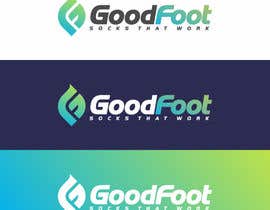
Design a Logo for a New Sock Company
- Status: Closed
- Prize: $81
- Entries Received: 148
- Winner: edvans

Contest Brief
We need a logo for our new Sock Company - GoodFoot - "socks that work"
Name: GoodFoot
Tagline: Socks that work
Description of business: Men's dress socks that are designed to control odor by wicking sweat. Our concept is to deliver the first "performance" sock for men in the workplace. Other features include it's ability to "stay-up" and not bunch at the ankle.
Logo examples we like: Betabrand, Evernote, Lululemon and (see others attached).
Recommended Skills
Employer Feedback
“Great job. I highly reccomend working with this individual.”
![]() chrisfetter, United States.
chrisfetter, United States.
Public Clarification Board
-

shobbypillai
- 10 years ago
How come everyone made the same logo as it was an blind contest?
- 10 years ago
-

Asifrbraj
- 10 years ago
I am surprised that contest Holder chooses a copy logo, he don't know unique and creative logo value, and i think he will get trouble for copyright issues. Best of luck......
https://www.google.com.bd/search?q=gf+logo&client=firefox-beta&hs=Vy2&rls=org.mozilla:en-US:official&channel=sb&tbm=isch&source=iu&imgil=TaJLA_qb_50CpM%253A%253Bhttps%253A%252F%252Fencrypted-tbn3.gstatic.com%252Fimages%253Fq%253Dtbn%253AANd9GcQC4mHYsmxREsxIjCNtzjTKsfrl7Fe6gbTbBzH8oKAXjDL-Khp_%253B325%253B260%253Bfuxb56LcjxUJwM%253Bhttp%25253A%25252F%25252Flogopond.com%25252Fgallery%25252Fdetail%25252F12922&sa=X&ei=5rXYUpzgI8fLrQeh3YCwDQ&ved=0CEMQ9QEwCQ&biw=1366&bih=661&dpr=1#facrc=_&imgdii=_&imgrc=TaJLA_qb_50CpM%253A%3Bfuxb56LcjxUJwM%3Bhttp%253A%252F%252Flogopond.com%252Flogos%252Fc678893be1fe6666c098672654e2ad0b.png%3Bhttp%253A%252F%252Flogopond.com%252Fgallery%252Fdetail%252F12922%3B325%3B260
http://logopond.com/gallery/detail/12922- 10 years ago
-

jhaypalileo
- 10 years ago
#110
- 10 years ago
View 1 more message
-
jhaypalileo
- 10 years ago
thansk sir
- 10 years ago
-

Contest Holder - 10 years ago
jhaypalileo, #164 is in the top 2 now. We are deciding between that one and one other. If you can show us any modifications that would help... Possibly try changing the negative 'f' to be smaller. Really anything creative you can do with subtle variations of the shape and appearance of the GF logo. Thanks!
- 10 years ago
-
inrealms
- 10 years ago
- 10 years ago
-
Contest Holder - 10 years ago
not bad, thanks
- 10 years ago
-
shobbypillai
- 10 years ago
Plz check #165 thanks
- 10 years ago
-

abhig84
- 10 years ago
Please rate and provide feedback for #162 and #163 .... thanks...
- 10 years ago
-

edvans
- 10 years ago
#91 please..
- 10 years ago
-

janithnishshanka
- 10 years ago
Sir! can I know #80 in that top 3 please ?
- 10 years ago
-
edvans
- 10 years ago
Thank you!
Please check PM..- 10 years ago
-

asadalirehan123
- 10 years ago
SIR PLEASE CHECK #105 THANKS
- 10 years ago
-
cristigoia
- 10 years ago
Please check #92 . thank you!
- 10 years ago
-

rivemediadesign
- 10 years ago
please check #81
- 10 years ago
-

Sety2000
- 10 years ago
could you please leave me feedback for #66, why its rejected, thanks
- 10 years ago
-
abhig84
- 10 years ago
Please rate and provide feedback for #67 ... thanks
- 10 years ago
-

alpzgven
- 10 years ago
#61 #62 Maybe?
- 10 years ago
-
Contest Holder - 10 years ago
Thanks for all your efforts. My favorite thus far are the designs that have a sophisticated font and really convey the "men's business sock" image. I am really liking the simple creative logos where you have a "F" inside of a "G". Thanks again!
- 10 years ago
-
janithnishshanka
- 10 years ago
- 10 years ago
-

medchamp
- 10 years ago
Check #53
- 10 years ago
-

izabela357
- 10 years ago
pls check #49 thanks
- 10 years ago
-

grafixsoul
- 10 years ago
Hi sir please private comment.
- 10 years ago
-
hellodbr
- 10 years ago
Hi there, any feedback on #2 ? Thanks :)
- 10 years ago
-
Contest Holder - 10 years ago
It's not bad. Although I feel the sock is too playful and doesn't feel like 'MENS BUSINESS'. I'm also not crazy about the pale green color.
- 10 years ago
-
creativeartist06
- 10 years ago
Logo by CA
- 10 years ago
How to get started with contests
-

Post Your Contest Quick and easy
-

Get Tons of Entries From around the world
-

Award the best entry Download the files - Easy!