When you’re designing a logo for your startup company, there’s a lot of things to consider. You want to appeal to the right audience, you want something eye-catching, and you need something that doesn’t cost as much as the millions that established companies can spend to change their branding. It’s hard to know where to start, but the good news is that you can do most – if not all – of the work yourself. There are just six things that you need to keep in mind throughout the design process:
- Legibility
- Relevancy
- Distinctiveness
- Versatility
- Tone
- Originality
Not sure how to apply all of these? That’s okay: this article will explain each one, along with a couple of logos that really encapsulate the principles above. If you’re in the process of designing a logo at the moment, you might want to grab a piece of paper to jot down any thoughts that come to you.
Legibility
This one is probably the most obvious of the six ‘rules’. You need a logo that everyone can read. Imagine if Google chose to do their logo in an unreadable font. Look at the example below using a font called “wonderlicious”: the Gs almost look like Cs and the letters aren’t very wide, so it’s difficult to read at a glance.
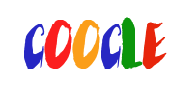
Google might still have become the mighty entity it is now with that logo (and the case study below shows that they did go through a lot of logo changes before reaching the simple, distinctive logo they have today)—but that font would have made mistakes more common. “Coocle”? “Coogle”? “Coocie”?
When you’re picking your font and color scheme, you also need to think about legibility for people with visual issues. A really good logo is crisp and clear enough that even people with minor visual impairments can recognize it at a glance. This might mean using sans-serif fonts—these are fonts without extra lines that can confuse the eye, and sometimes cause issues for people with dyslexia. In addition, you should consider the color of your font and the background you use: black on yellow is particularly distinctive for people with visual issues, while white on grey is very difficult to read.
Relevancy
This one is pretty simple too. The worst kinds of logos include images that aren’t related to the product or company in any way – those that were just done to look unique or were made simply for the ‘cute’ factor. If your company has a mascot or something, you might want to include the mascot in the logo, but if you’re a computer hardware company, then you should probably steer away from using clipart of a rabbit. It has nothing to do with your company and could create false expectations (although it did work for Apple).
If you do have a mascot, though, using it in the logo and other marketing is a great way to make your company stick in people’s minds. That’s why the key issue is relevancy. If you’re starting up a company that connects people so they can take care of each other’s pets during absences, then that rabbit might be the right image to include in your logo.
Distinctiveness
This is probably the first thing on your mind when you’re trying to create a logo for your startup. You need something that’s going to stand out from the crowd, something that immediately catches people’s eyes. There’s a lot of competition out there at the moment, especially in Web-based companies, and your logo is the first chance you have to capture someone’s attention and persuade them to remember your company, buy your product, or use your service.
What sort of things can you use to make your logo look distinctive? Consider using unique fonts, an unusual color palette, patterns, or even get a graphic designer to whip you up something totally unique. You could use a site like coolors.co to come up with a striking color palette that you can use in your design.
It’s hard to think of a distinctive look on-the-spot, so this is where product testing comes in—and though that sounds daunting, it really only requires copying your friends or colleagues in an email and asking them what they think. Listen to feedback and test your logo on as many people as possible. You won’t be able to create something that suits everybody, but the feedback will help you refine your image.
Versatility
When you’re making your image, you need to think about how adaptable it is to different needs. For example, you might want a banner logo with a full name and even a slogan or motto on it, but that isn’t always going to be useful. You might also need a smaller icon—think about Twitter’s iconic bird and Facebook’s F. This can be useful as the “favicon” for your site (the little picture that appears on tabs, as below), or wherever you need a smaller image for design or space reasons.

Image showing favicons for various sites
It might be as simple as taking the initial letter of your startup’s name, but it’s definitely worth considering while you’re making your logo. And of course, you can make it match your logo by using the same colors, too.
In addition, you need to make sure your logo can be used in all the contexts it might be necessary. You need to think about how it will look on a business card as well as how it’ll look online. You should think about whether you want it to have a colored background, or whether you want it to show the page background behind it. If you’re going with the latter, you need to think about the colors again and make sure they’ll stand out against common background colors like white, black and grey, if not other colors as well.
Tone
Since your logo may very well be the first thing people notice about your site—whether it's because of their first visit or via banner ads and other marketing methods—you need to make sure it gives the right first impression. If you’re creating a child-focused company, maybe something similar to the childish font Comic Sans MS would be a good choice for your logo—but if you want to look professional, then that’s definitely not the right look.
Your color palette can also have an effect on tone. If you’re designing a logo for a funeral director’s company, baby blues and baby pinks would look totally inappropriate—but perfect if the company deals with baby products. People can have very strong associations with colors, so you can’t just pick something that just looks good.
Originality
Despite all that, there’s a sixth thing your startup logo needs, and this is the hardest of all. This is the point where you might want to flout one of the rules above: if your company is daring and new, maybe it would be appropriate to create a totally outrageous color palette. You can make yourself memorable with a weird mascot or slogan that doesn’t seem relevant, or make a clever parody of an existing logo to make people look twice.
Whatever you do, the most important thing is product testing—whether that’s sending out a questionnaire to your friends or analyzing the success of your advertising over time. Don’t be afraid to try new things!
A Case Study: Google
When Google started out in 1997, they launched with this logo:

You can see that this clearly isn’t a logo that's destined to become iconic. It’s not as legible as the later versions, and they hadn't hit on the right color combination yet to be really distinctive. Since it’s simple, with just the stylized letters, it would be possible to adapt just the G for a smaller logo or favicon. Each successive version of the Google logo has become more and more simple: the effects on the letters of the 1997 logo quickly gave way to simpler shading, and in 2013, the shading was removed altogether when they went with a flat design. Even in 1997, the focus of the logo was the letters, without any extra images

1998-1999
1999-2010

2013-2015
Finally, in September 2015, Google went for their most drastic step yet—something which is probably beyond the reach of most startups. Increasing the legibility and distinctiveness of the logo, Google introduced a new sans-serif font designed in-house. This font is also used in the Alphabet Inc logo, providing cohesiveness across the company as well.

2015 – present
Despite all the changes, it’s clear that the logo has always referred to the same company, through color changes and gradual tweaks. You’d never mistakenly call it Yahoo’s logo! If you can create a distinctive color palette and layout, you’ll have a versatile font you can adapt to whatever use you need over time. Google has made an art of this with their Google Doodles, all of which use the basic design while adding fun extra elements.
This article started off by suggesting six rules for designing a logo—but the reality is, it boils down to one really important rule:
You need to get (and keep) people’s attention.
If you keep that in mind when designing your logo, you can’t go wrong!