New logo, rebranding ARTMOST

  • Status: Closed
  • Prize: zł200
  • Entries Received: 6
  • Winner: MiroSlavic

Contest Brief

ENG-below
Firma związana ściśle z architekturą mająca na celu w przyszłości rozwinięcie profilu o projektowanie mostów. Tworzy ją młody zespół, kreatywnych ludzi nie bojących się wyzwań i podążającymi ciągle za trendami.

Wygląd logo:

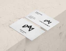
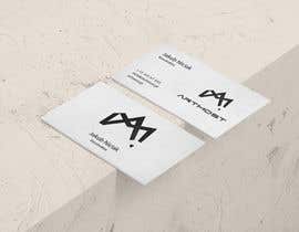
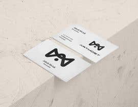
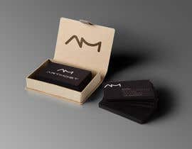
Minimalistyczne, dobrze wyglądające zarówno jako czarne logo na białym tle, a także jako logo białe, na kolorowym zdjęciu w tle, nawiązujące do charakteru firmy: projektowania architektury oraz mostów. Znak chwytliwy i rozpoznawczy, mile wskazane powiązanie do nazwy ARTMOST, która w tłumaczeniu języka polskiego składa się z dwóch członów : art - sztuka, artystyczny, most - most, natomiast po angielsku oznaczająca podkreślenie kreatywnego myślenia.

Company profile

The company closely related with architecture aims to develop a
profile for bridges design in the future. The company creates a young
team, creative people who are not afraid of challenges and follow the
trends.

Logo look
Minimalist, good looking both as a black logo on a white background,
and also as a white logo on a colored background photo, referring to
the character of the company: design architecture and bridges. Logo
ought to be catchy and recognizable. Logo should refer to company name
ARTMOST.
ARTMOST translation in Polish consists of two parts:
art - art, artistic
most - bridge
In English ARTMOST means to emphasize creative thinking.

Recommended Skills

Top entries from this contest

View More Entries

Public Clarification Board

  • marcoosvlopes
    marcoosvlopes
    • 6 years ago

    Please sir, check #79 and #80

    • 6 years ago
  • joannakraszka
    Contest Holder
    • 6 years ago

    To everyone who wants to participate in tender.

    I wish to talk to all of You, seperated, but time is limitted, i think all of You will forgive me that.
    We wish to have logo which will be more connected to architecture, desing, project field. Some of proposition are great but not connected with our firm at all.
    The name of company is pretty long, that is why maybe is better to create logotype which will be recognizible and looking good with whole name of company. Idea of using full name of company as logo, did not work out, for example GOOGLE, letter G can be present seperated and with full name of company as well. I recommend to check it put our exisitng website, where is our exisitng logo, which we planning to change cause is too long and not practical - www.artmost.pl
    Under link below you can find logotypes saved on pintrest which we like:
    https://pl.pinterest.com/PolitaNohra/grph-logo/

    I hope i explain idea better
    Wish good luck :)

    • 6 years ago
  • marcoosvlopes
    marcoosvlopes
    • 6 years ago

    Please, check #41 #42 #44

    • 6 years ago
  • marcoosvlopes
    marcoosvlopes
    • 6 years ago

    Please, check #38 and #39

    • 6 years ago
  • marcoosvlopes
    marcoosvlopes
    • 6 years ago

    Please, check #24 #25 #26

    • 6 years ago
  • MiroSlavic
    MiroSlavic
    • 6 years ago

    Proszę o nakierowanie na właściwy tor. Czy iść w stronę powyższego pomysłu, czy wolą państwo Coś zupełnie innego? #3

    • 6 years ago
  • marcoosvlopes
    marcoosvlopes
    • 6 years ago

    Please, check #4 ! Have 2 pages

    • 6 years ago
  • marcoosvlopes
    marcoosvlopes
    • 6 years ago

    Please, check #1

    • 6 years ago

Show more comments

How to get started with contests

  • Post your contest

    Post Your Contest Quick and easy

  • Get tons of entries

    Get Tons of Entries From around the world

  • Award the best entry

    Award the best entry Download the files - Easy!

Post a Contest Now or Join us Today!