
RustyWolfDesigns
Romania

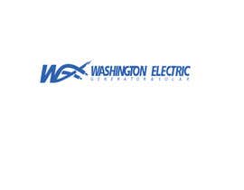
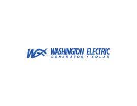
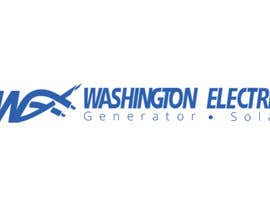
Just need a minor adjustment to the company Logo for www.washingtonelectric.net
Colors for the main logo need to stay very close. Overall shape and Dimension of main logo should be the same. Size of each element could be different.
Just need to incorporate the Words “Generator” and “Solar” into the logo.
The arrangement of the words could be different. Maybe stacked? Or ? I’m not sure.
Need your help on this one! I found an example of what another company did. Oak Electric....maybe you can make it look better than that?
Thanks
“Great Job!”
![]() Electricity101, United States.
Electricity101, United States.


Post Your Contest Quick and easy

Get Tons of Entries From around the world

Award the best entry Download the files - Easy!
