Define and make our logo Look better ( quick fix )
- Status: Closed
- Prize: $50
- Entries Received: 45
- Winner: Arpit1113
Contest Brief
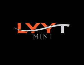
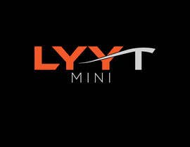
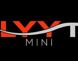
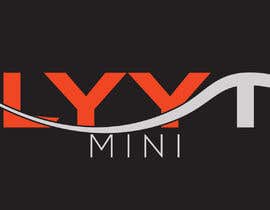
TO define and fix the Current logo that we have .
Currently the T isn't very smooth
The edge of the Y isn't very visible because the T line is blocking it , , The T line should be lower
Recommended Skills
Employer Feedback
“@Arpit1113 won the contest on 21 February 2020”
Tony993, United States.
Top entries from this contest
-
Arpit1113 India
-
Arpit1113 India
-
soniasony280318 Bangladesh
-
am0rty Indonesia
-
soniasony280318 Bangladesh
-
am0rty Indonesia
-
soniasony280318 Bangladesh
-
soniasony280318 Bangladesh
-
soniasony280318 Bangladesh
-
am0rty Indonesia
-
DeoxraArt Sri Lanka
-
ROMANBD7 Bangladesh
-
soniasony280318 Bangladesh
-
soniasony280318 Bangladesh
-
ReallyCreative India
-
ReallyCreative India
Public Clarification Board
How to get started with contests
-
Post Your Contest Quick and easy
-
Get Tons of Entries From around the world
-
Award the best entry Download the files - Easy!