Create a "smart" & captivating look for my version of the Business Model Canvas

  • Status: Closed
  • Prize: €200
  • Entries Received: 17
  • Winner: Chivalancer

Contest Brief

Hi, I am the owner of Business Exploration, a small consulting specialized in coaching SMBs and Startups. I offer a coaching program that in 8 days helps the Entrepreneurs create a complete sales plan for their high tech innovation from strategizing the business model to negotiating price with the clients.
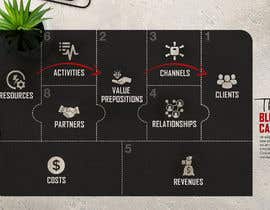
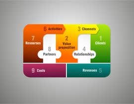
The starting point of the coaching program is a revised version of the Business Model Canvas:
The Blue Canvas. The revision consists only in repositioning the blocks so that appears evident that the Business model Canvas is capable to describe the 3 "flows" of a business:
the logistic flow, from resources to clients
the information flow, from resources to clients
the cash flow, from clients to resources
My clients really appreciate this BMC, and it has even been adopted by BIGJUMP, a innovation consultant company in Brisbane Australia.
They have told me that the colored version of the Blue Canvas is a bit "old style" and needs a refresh.

SO: I am looking for a professional designer capable to give a simple, smart, clear look at the new version of the colored Blue Canvas, capable to transfer all the concept of this template in a captivating style.

references for the Blue canvas:

Article describing why I changed the position of the blocks :

http://www.business-exploration.com/blue_canvas.html?utm_source=freelance

attached the colored version of the Blue Canvas

Recommended Skills

Employer Feedback

“I appreciated the willingness to do the "extra mile" ”

Profile image ingtosi1, Italy.

Public Clarification Board

  • ingtosi1
    Contest Holder
    • 4 years ago

    1) icons are too complicated and misleading: Resources think something like "nuts & bolts" "components" "briks" | activities: this is a process. process is made by circle and arrows or something similar search for "process diagram". PArtners: they are sherpa, not dealmakers. they helpò you, do not agree. | Value proposition: tkae out the diamond and put a light bulb | Channels: think it like a bridge, it has an entrance and an exit. | relationships. make it less complicated. here "relationship" stands for "communication" "make them aware" "get in contact"

    • 4 years ago
  • ingtosi1
    Contest Holder
    • 4 years ago

    About the colors: they are not imporatn. you can submit a colored or a B&W template. up to you.

    • 4 years ago
  • ingtosi1
    Contest Holder
    • 4 years ago

    3) the sequence to be used to read the blocks is of paramount importanve: you read the blocks and understand the processes and how the relationships sustain the value creation and delivery only if you A) start from the Customer B) read the blocks form Right To Left. Can you craft a template whare these 3 concepts are evident and simply experessed?

    • 4 years ago
  • ingtosi1
    Contest Holder
    • 4 years ago

    I need a new canvas look. e.g.: the blocks on the canvas are 9. if you kill the blocks merging them you are killing the canvas. There are three basic concepts in my article: 1) the upper blocks are part of a process. if you have an idea of what a process map is, you understand what I mean. If you never draw a process map in your life, probably you can not add value this time. they are related to the classic Taylorism organizational models 2) the central blocks are connecting resources to value proposition to client through relationships. Relationships are at the base of mayoism, an organizational theory based on the central role of relationships among persons, in order to create value. Can you model the concept of relationships better than my idea of using puzzle-like borders for the "partners" and "relationships" blocks?

    • 4 years ago
  • FranciscoFusco
    FranciscoFusco
    • 4 years ago

    Hi CH, after reading your article and seeing some proposals I'm a little bit confused. You've clearly put some thoughts on the new canvas structure, but when I read what you are looking for and see some proposals I don't understand if you need just a new canvas look or a new canvas structure. Thanks!

    • 4 years ago
  • ingtosi1
    Contest Holder
    • 4 years ago

    Thx I see we are slowing moving into the direction. Pls inject more creativity into the two "Mayo" and "Taylor" flows. I would also like to see the "R2L" direction on it. I recommend you read and understand my article on business model canvas...

    • 4 years ago
  • vntkshp
    vntkshp
    • 4 years ago

    #sealed

    • 4 years ago
  • ingtosi1
    Contest Holder
    • 4 years ago

    I see people taking this challenge more seriously. thanks a lot. Pls try to add more creativity. and try to keep the concept of Canvas - If you draw arches that are outside the canvas : "they do not work in conveying the meaning of company's processes". again: do not submit things I can do by myself. I am looking for designer professionalism, not for amatours....

    • 4 years ago
  • ingtosi1
    Contest Holder
    • 4 years ago

    I would recommend you take a pencil sharpener and use more personal creativity...on a white paper.

    • 4 years ago
  • ingtosi1
    Contest Holder
    • 4 years ago

    Pls do not submit things I could do myself. I asked professional help. Fine with ikons, but pls be sure they are aligned with the meaning of the blocks....

    • 4 years ago
    1. francescoeurito
      francescoeurito
      • 4 years ago

      Salve! Trova la mia proposta al #7

      • 4 years ago
  • DataTrueStoryDE
    DataTrueStoryDE
    • 4 years ago

    As for the colors, should I have to keep the current,and is there any relation between the colors.

    • 4 years ago
  • DataTrueStoryDE
    DataTrueStoryDE
    • 4 years ago

    Hello, is there a specific size you want for the infographic, and would you like to use the description as in "The Blue Canvas (BMC 2.0)" PDF file.

    • 4 years ago
  • ingtosi1
    Contest Holder
    • 4 years ago

    Please go online and have a look to classic Business Model Canvas representations. The Business Model Canvas is a masterpiece of clarity and simplicity. Please also read the article and look at the picture I attached. I do not want something far away, I just want something professional.
    The Upper blue blocks are arrows becasue it should convey the idea of the logistic flow. This flow has a direction. The lower blocks are kind of puzzle pieces cause they should convey the idea of networking and cooperation.

    • 4 years ago

Show more comments

How to get started with contests

  • Post your contest

    Post Your Contest Quick and easy

  • Get tons of entries

    Get Tons of Entries From around the world

  • Award the best entry

    Award the best entry Download the files - Easy!

Post a Contest Now or Join us Today!