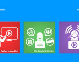
Set of 3 Metro Windows 8 style graphic tiles
- Status: Closed
- Prize: $100
- Entries Received: 17
- Winner: khusnunirawan

Contest Brief
We are an independent Anglican Girls' School in Brisbane, Australia.
The users/audience of these products includes teaching and support staff and our students. Our students range from Kindergarten to High School/Year 12.
The majority of viewers
Recommended Skills
Employer Feedback
“Great quality work! A clear contest winner. Actively refined contest entry based on feedback on designs submitted. We are excited to see our users response to the designs. Would hire khusnunirawan again for future projects. Well done.”
![]() cerbs, Australia.
cerbs, Australia.
Public Clarification Board
-
Michael45
- 11 years ago
congrats khusnunirawan!!!
- 11 years ago
-

khusnunirawan
- 11 years ago
Thanks Michael45 :)
- 11 years ago
-

Contest Holder - 11 years ago
Thank you all for your great submissions. I will award the prize very soon. Keep an eye out for our future contests as many of you presented great work and we would like to see you enter again.
-Nathan- 11 years ago
-
khusnunirawan
- 11 years ago
i will waiting for the next contest...:)
- 11 years ago
-

Millasseau
- 11 years ago
Check #32 ;)
- 11 years ago
-

saymun
- 11 years ago
PLEASE CHECK#27
- 11 years ago
-

designgrids
- 11 years ago
Please, Check #17 #18 #19 #20 waiting for your feedback.
Thanks.- 11 years ago
-

AnggiAlfonso
- 11 years ago
for ch
#15
I am here to improve sport in which I add a logo image balls, and rugby.
then I improve on the collaboration hub.
where I made three pictures of people. the person on top was a teacher and two images below serve as a student ..
the image is connected as a table. Where students and teachers can be connected as in a table even if it is virtual.- 11 years ago
-
sivakf
- 11 years ago
pls chk #14 also with diffferent icons
- 11 years ago
-
sivakf
- 11 years ago
Thanks for the feedback.I just reworked based on the feedbacks.Pls chk #9
- 11 years ago
-
Contest Holder - 11 years ago
Feedback continued...
*The use of a book as a symbol for 'learning' is a common choice but I would love to see something that shows that The Learning Centre is about eLearning & collaboration too. I think #2 is on the right track with this. #2 is good because it includes many things that can be done in SharePoint which we use for The Learning Centre.
*I like font that has been used which is also used by Microsoft. I think this looks nice, well done #2 , #3 and #6 for trying that idea. I like it.
I hope this feedback helps. Only 1day to go!
Looking forward to seeing some refinements and further entries
-Nathan- 11 years ago
-
Contest Holder - 11 years ago
Thank you for all the entries so far. Here is some feedback for all designers.
*I think that having all tiles square such as entry #1, #2 , #3 and #4 is good.
*Sub-text is not needed. The titles on their own are fine: The Learning Centre, The Collaboration Hub, HuddleTV. Sometimes a good icon doesn't need a title if the images show the theme well.
*I like the solid colour backgrounds and it is interesting to see that many of you have chosen to use the colours that Microsoft used in the Windows 8 UI. I think this nice. If the colours look good with the theme of your tile I am happy with that too.- 11 years ago
-

TheFlowFX
- 11 years ago
Can you have a look at your PM. I don't want to submit my design otherwise other people may see it and copy it.
- 11 years ago
View 2 more messages
-
Contest Holder - 11 years ago
Thanks for providing that advice. Hope to see some entries soon.
- 11 years ago
-
Contest Holder - 11 years ago
Thanks for your entry TheFlowFX, The puzzle pieces for The Collaboration Hub are an interesting idea. I think it would be best to keep the icons all square. I know there are long tiles in Windows 8 though, but as our initial use for them is on the web it might be better to have a consistent size and shape.
- 11 years ago
-
sivakf
- 11 years ago
Pls chk and give feedbacks
- 11 years ago
-
Contest Holder - 11 years ago
Hi sivakf, I think the sections within the tiles is an interesting idea. It would be interesting to see this design re-worked without the smaller text, Eg. without the words, calendar, guides, etc. Also one of the icons is slightly mispelled. The Collaboration Hub is the correct spelling. Thanks for your entry.
- 11 years ago
-

yam1231
- 11 years ago
Please check #4 and give some feedback thankx :)
- 11 years ago
-
Contest Holder - 11 years ago
Hi yam1231, your entry is very similar to the one Michael45 uploaded first. One of the icons has the wrong name on it, the product is called 'The Collaboration Hub'.
- 11 years ago
-

HamedTaha
- 11 years ago
Correction My entry is #6
- 11 years ago
-
HamedTaha
- 11 years ago
my entry #5
- 11 years ago
-
Contest Holder - 11 years ago
Thanks for your entry Michael45. This is a great start.
I would love to see the integration of the idea of collaboration, communication and interaction as well as the concept of document management.
I like the gradient on the tiles as long as it is in a style that we will be able to extend from easily in the future. For example if this tile was placed in the banner section of a site, or elsewhere. I guess if we have the file as a .PSD, .AI, that layer can be hidden as required.
Thanks again!- 11 years ago
-

marsalank
- 11 years ago
can you please provide details of size of the square?
- 11 years ago
-
marsalank
- 11 years ago
256x256 per tile?
- 11 years ago
-
Contest Holder - 11 years ago
256x256 looks right to me and appears consistent with the win8 UI/UX guides. We are not using the tile in Windows 8 immediately so we don't need the wide tile, or notification functionality, etc. Thanks for your question. Looking forward to seeing entries soon.
- 11 years ago
-

jagadeeshrk
- 11 years ago
you want the tile to be coded or just design ?
- 11 years ago
-
Contest Holder - 11 years ago
Just the graphic design is fine. We aren't implementing it as resizing or dynamic tiles at this stage just static images. Alternate representations, rollovers, etc might be good after we choose the best overall style, but they are not essential at this stage. As our project progresses we would need further graphics created to compliment these and possibly some assistance in UI/UX design.
Thanks for your question.- 11 years ago
How to get started with contests
-

Post Your Contest Quick and easy
-

Get Tons of Entries From around the world
-

Award the best entry Download the files - Easy!