Modern logo
- Status: Closed
- Prize: $100
- Entries Received: 8
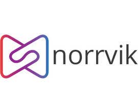
- Winner: sray10

Contest Brief
i am looking for logo design it should be very modern very catchy the logo should be a colored object and beside it the name "norrvik"
Note (chose a font that will be special to part of our identity
the color scheme is attached
waiting to see the good work
please do not copy from google search make something unique
i am in hurry when i get the special one i will award immediately
Recommended Skills
Employer Feedback
“great designer we will work together a lot see you soon”
![]() habibissa, Saudi Arabia.
habibissa, Saudi Arabia.
Public Clarification Board
-
iteraf7
- 7 years ago
hello sir you want any word logo
- 7 years ago
-

zaldslim
- 7 years ago
all is frustrated now
- 7 years ago
-
AESSTUDIO
- 7 years ago
Please Check : #220 #221 #222 #223 #224
- 7 years ago
-
AESSTUDIO
- 7 years ago
Please Check #216 #217
- 7 years ago
-

bluebellgraphic
- 7 years ago
Kindly check #202 #203 #205
Thanks- 7 years ago
-

banklogo40
- 7 years ago
Sir please check #198 #199
- 7 years ago
-

DiogoCabral7
- 7 years ago
If you want something unique, maybe your breifing should reflect that. As I see it, the more generic and innacurate your briefing is so would your logo. Just a thought
- 7 years ago
-

YKNB
- 7 years ago
yes, please elaborate of what you really need. Not just make up a random logo that looks cool and nice. "Logo" is what reflects your brand and not just some random image or what. Just saying.
- 7 years ago
-

Contest Holder - 7 years ago
i can see that there is no more ideas, you can use the idea of cloud services but do not copy form similer logos
- 7 years ago
-

designinjector
- 7 years ago
Plz check #154.Thanks
- 7 years ago
-

deborahsb
- 7 years ago
#sealed
- 7 years ago
-
zaldslim
- 7 years ago
wow asking for seal when ur logo is lot a like of uk computer logo
- 7 years ago
-
deborahsb
- 7 years ago
Im sorry. I dont copy anything. Lots of logos looks alike. If you use world iconds, it conccepts or just a letter, there will always be one alike. I use my creativity.I dont need to copy. Specially in the same contest like lot of people do. Anyway. I apreciate your remark. Blessings
- 7 years ago
-
AESSTUDIO
- 7 years ago
Please Check : #170 #171 #172
- 7 years ago
-

farzana1994
- 7 years ago
please check #162 & #164.
- 7 years ago
-

fokirashimul
- 7 years ago
please check:#163
- 7 years ago
-
ShahriarShawon10
- 7 years ago
please Check #161. Have a nice day sir. Thank you.
- 7 years ago
-
designinjector
- 7 years ago
Plz check #154.Thanks
- 7 years ago
-
Contest Holder - 7 years ago
again alot of designer work without reading teh descriptoion:for the object logo beside the name "norrvik" DO NOT USE the letter N
- 7 years ago
-

bd600102
- 7 years ago
please check #136 #137 Thank you
- 7 years ago
-

rosarioleko06
- 7 years ago
Entry #132 PLEASE CHECK SIR
- 7 years ago
-
zaldslim
- 7 years ago
122 is pldt logo
- 7 years ago
-

sk03150329
- 7 years ago
Sir please check #114
- 7 years ago
-
zaldslim
- 7 years ago
maybe there is no mac user here
- 7 years ago
-
zaldslim
- 7 years ago
only woff version is available
- 7 years ago
-
zaldslim
- 7 years ago
im windows user no available font for windows
- 7 years ago
-
YKNB
- 7 years ago
what are you trying to communicate in the logo?
- 7 years ago
-
Contest Holder - 7 years ago
no one is using the font :glyphicons-halflings-regular please use it for the word "norrvik" in small letter
- 7 years ago
-
Contest Holder - 7 years ago
prize has been upgraded from 50$ to 100$ let me see good work
- 7 years ago
-
Contest Holder - 7 years ago
for the name "norrvik" use the this font : glyphicons-halflings-regular
- 7 years ago
-
zaldslim
- 7 years ago
u rated no 38 and 14 they the logo is on the top
- 7 years ago
-
sk03150329
- 7 years ago
Sir please check #84
- 7 years ago
-
AESSTUDIO
- 7 years ago
Please Check : #81 #82 #83
- 7 years ago
-
AESSTUDIO
- 7 years ago
Please Check : #78 #79 #80
- 7 years ago
-
designinjector
- 7 years ago
Plz check #77 .Thanks
- 7 years ago
-

Maaz1121
- 7 years ago
#70
- 7 years ago
-
Maaz1121
- 7 years ago
please check #68
- 7 years ago
-

ekaterinalealf
- 7 years ago
Hello! Please check and rate #55 & #56, i really appreciate constructive feedback :). Thank you!
- 7 years ago
-
Contest Holder - 7 years ago
do not use the letter N as object beside the name create object
- 7 years ago
-
Contest Holder - 7 years ago
Dear all please do not use the N letter as an object beside the name
- 7 years ago
-
Contest Holder - 7 years ago
kindly use small letter in the name "norrvik"
- 7 years ago
-
Contest Holder - 7 years ago
still i am getting object logo above the name "norrvik' please put it beside it
- 7 years ago
-
Contest Holder - 7 years ago
the object logo should be beside the logo and not above it
- 7 years ago
-
Contest Holder - 7 years ago
the business is IT services and cloud (but do not use the cloud shape for the logo)
- 7 years ago
-
Contest Holder - 7 years ago
kindly make sure the object logo beside norrvik to be more than one color
- 7 years ago
-
fokirashimul
- 7 years ago
please check:#30
- 7 years ago
-

sanayafariha
- 7 years ago
CHECK #23 #25 #26 AND #27
- 7 years ago
-
Contest Holder - 7 years ago
i just got the name norrvik in color as logo i rejected, because i said i want opject beside the name so please do not send bad work
- 7 years ago
How to get started with contests
-

Post Your Contest Quick and easy
-

Get Tons of Entries From around the world
-

Award the best entry Download the files - Easy!