D3 Logo Contest
- Status: Closed
- Prize: $90
- Entries Received: 4
- Winner: designpalace

Contest Brief
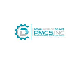
Looking for a Logo for D3 PMCS, Inc. We are a Project Management company for construction. Out company colors are Black, Gray and Tourquoise. I previously came us with a D3 logo because I needed something quickly. I like the metal look but the color of the 3 is off a little. Also need it in multiple formats (jpeg, tiff, photoshop, illustrator) so that I can print it on various merchanise, including a version for embrodery. While I like the overall idea of the existing logo, I'm open if someone comes up with something even better.
Logo is being used on stationary, business cards, marketting materials such as t-shirts, water bottles, pens, etc.
Recommended Skills
Employer Feedback
“Very happy with the logo. A pleasure to work with. ”
![]() Baldwin10, United States.
Baldwin10, United States.
Public Clarification Board
-

Contest Holder - 6 years ago
Thank you to everyone who participated in the contest. I've selected the logo that works best for my needs, but there were many logos that were amazing. There is clearly a lot of talented people out there.
- 6 years ago
-

zftushi
- 6 years ago
#686 & #687
- 6 years ago
-
zftushi
- 6 years ago
#685
- 6 years ago
-

sojib8184
- 6 years ago
643
- 6 years ago
-
Contest Holder - 6 years ago
I use gears along in my brochure. I don't know if it's feasible to incorporate a gear into the design, but that would be a plus.
- 6 years ago
-

matheusfra
- 6 years ago
#633, #634, check please! Thank you! :)
- 6 years ago
-

azhanmalik360
- 6 years ago
And #632
- 6 years ago
-
azhanmalik360
- 6 years ago
Check #631
- 6 years ago
-

EvgeniyaEVA
- 6 years ago
Please, check my Entry #627 , thank you very much!
- 6 years ago
-
sojib8184
- 6 years ago
622,623
- 6 years ago
-

LogoExpert21
- 6 years ago
https://www.google.com/search?q=d3+logo&tbm=isch&tbo=u&source=univ&sa=X&ved=0ahUKEwiit_qRqKvVAhVF2LwKHWvYCfoQsAQIJg&biw=1525&bih=736#imgrc=xf6ND_Re92BKzM:
- 6 years ago
-
Contest Holder - 6 years ago
Color of choice is SW 6789 Blue Mosque
R:1 / G:129 / B:158 or SW 6788 Capri R:1 / G:160 / B:184 along with silvers and black- 6 years ago
-

Junaidy88
- 6 years ago
please check #594. Thank you!
- 6 years ago
-

rz100
- 6 years ago
Sir, please check my entry...\
- 6 years ago
-

Tahmidsami1
- 6 years ago
please check #586
- 6 years ago
-
azhanmalik360
- 6 years ago
Check #565 #566 #568 #569
- 6 years ago
-

JoyAhmad
- 6 years ago
please check #557
- 6 years ago
-
sojib8184
- 6 years ago
please check549
- 6 years ago
-
MasterMind223
- 6 years ago
please check #539.
- 6 years ago
-
MasterMind223
- 6 years ago
please check #528#529....thanks.
- 6 years ago
-
azhanmalik360
- 6 years ago
Check #516 #517
- 6 years ago
-
Contest Holder - 6 years ago
To new possible entries, feel like my wants got buried in the drama so reposting: Prefer Capital D. More emphasis on the D than the 3. Color of choice is SW 6789 Blue Mosque
R:1 / G:129 / B:158 or SW 6788 Capri R:1 / G:160 / B:184 along with silvers and black The D3 originated from Design Develop Deliver. A second subtitle might be Project Management | Construction Services. This is a logo I plan on living with for the next 20 years so excited to finalize my choice in the next 3 days. I have a few favorites, but if you have that stand out that could change my mind, bring it on. There have been some really out of the box designs that I really liked, but because it wasn't an obvious D3, it wasn't the fit for me. Need a design that someone who doesn't know me, could easily read the company name. Thanks again for your entry.- 6 years ago
-

gustavosaffo
- 6 years ago
Hello Miss, I saw many copies from first original concept in your contest. My advice is to look for the first concept that you liked and work with the designer, would be much more fair. Here we are all working for you, but individually, it is not a collective idea, that would be unethical.
- 6 years ago
-
Contest Holder - 6 years ago
CutStudio, point noted. Please feel free to withdraw from the contest. You will not be one of the awarded designs. Thank you.
- 6 years ago
-

TheCUTStudios
- 6 years ago
Ok Thank you
But Reject all the entries that are copied from my property (D3 design)- 6 years ago
-

shantaakter1002
- 6 years ago
PLEASE CHECK# 462
- 6 years ago
-
TheCUTStudios
- 6 years ago
Hi contest holder Believe me .
May be you are not fully aware about freelancer's terms and conditions :
It is 100% sure that he is violating the rules
I am the owner of D3 design . Box arround the D3 is not matter .
You can verify it from here :
https://drive.google.com/open?id=0B-6ht9iDpzhYQmVlUUdGYUJQMjQ- 6 years ago
-
TheCUTStudios
- 6 years ago
are you agree that D3 is 100% same like mine??
verify it here :
https://drive.google.com/open?id=0B-6ht9iDpzhYQmVlUUdGYUJQMjQ- 6 years ago
-
TheCUTStudios
- 6 years ago
I am going to report the freelancer staff about this issue .
I am the owner of this D3 design .
LogoExpert21 is the owner of fake account He created his accounts a few hours ago .- 6 years ago
-
TheCUTStudios
- 6 years ago
this is the reason that he copied my design , He is using fake profile that's why don't have any fear of account suspension .
- 6 years ago
-
TheCUTStudios
- 6 years ago
this D3 design is mine Verify it from here:
https://drive.google.com/open?id=0B-6ht9iDpzhYQmVlUUdGYUJQMjQ
This is clearly mention in terms and conditions that no one can copy or modify someone else design- 6 years ago
-
shantaakter1002
- 6 years ago
please check#459
- 6 years ago
-
Contest Holder - 6 years ago
Please keep in mind that if your entry was rejected, it doesn't mean that I didn't like it, but rather that it didn't make the top 5-10. It's my method of sorting my top picks, verses new entries verses once that I think I'm passing on. In the end, I may revisit the entries to make sure I didn't hastily hit reject during one of the days where I had 100+ entries. Thank you again for your efforts.
- 6 years ago
View 1 more message
-
TheCUTStudios
- 6 years ago
his design is similar to my design .
This D3 concept is mine .
How can you rate copied concept .I donot want that select my design but i cannot bear that someone else using my design- 6 years ago
-
TheCUTStudios
- 6 years ago
check it here :
https://drive.google.com/open?id=0B-6ht9iDpzhYQmVlUUdGYUJQMjQ- 6 years ago
-
TheCUTStudios
- 6 years ago
Hi Contest Holder:
The top rated entry copied my design , Its 100% same like my D3 design .
the freelancer name " LogoExpert21" copied my design .
Why you rejected my designs and rated the copied designs??- 6 years ago
-
Contest Holder - 6 years ago
I liked his design better. Sorry! Yours was too much about a box which has nothing to do with my company. I realize you think it's similar, but honestly almost all the entries are similar. Its a D and a 3. The ones that are really outside the box are great, but not always immediately recognizable that its D3 which is really what the logo is all about. Its not personal, but need to eventually narrow down the contest to make sure that what I pick works for me now and the next 20 years of my business.
- 6 years ago
-
TheCUTStudios
- 6 years ago
Verification Link :
https://drive.google.com/open?id=0B-6ht9iDpzhYQmVlUUdGYUJQMjQ
This against the freelancers terms and conditions ,
You now why we withdrew our first design? Because its have only 20 to 30% similarities with someone others design.- 6 years ago
-
TheCUTStudios
- 6 years ago
D3 is the main part of the logo .
D3 is 100% copied from my designs .- 6 years ago
-
TheCUTStudios
- 6 years ago
The LogoExpert21
is fake profile which is created 20 houres ago :
verify it here:
https://www.freelancer.com/u/LogoExpert21.html
he 100% copied my design .- 6 years ago
-
LogoExpert21
- 6 years ago
Please check it my new Entry #449 and feedback me
- 6 years ago
-
azhanmalik360
- 6 years ago
Check #400 $401 #402 #403
- 6 years ago
-

JIzone
- 6 years ago
please chrck #389 #390
- 6 years ago
-

Logomask
- 6 years ago
check#385#386#387#
- 6 years ago
-
Logomask
- 6 years ago
please check#382#383#384#
- 6 years ago
-
Contest Holder - 6 years ago
Using reject to sort thru and finalize my decision. But had to reject so many amazing entries. Some were so close, but just not exactly right. There is definitely a lot of talent out there.
- 6 years ago
-
Contest Holder - 6 years ago
Prefer Capital D. More emphasis on the D than the 3. Color of choice is SW 6789 Blue Mosque
R:1 / G:129 / B:158 or SW 6788 Capri R:1 / G:160 / B:184 along with silvers and black- 6 years ago
-
Contest Holder - 6 years ago
Also not a fan of backwards letters or numbers.
- 6 years ago
-
MKgraphic17
- 6 years ago
Please Check Entry #328
- 6 years ago
-
MasterMind223
- 6 years ago
please check #315#316....thanks a lot.
- 6 years ago
How to get started with contests
-

Post Your Contest Quick and easy
-

Get Tons of Entries From around the world
-

Award the best entry Download the files - Easy!